Applies to: Web Payments SDK
Learn how to apply custom styles to the Web Payments SDK card payment form.
The Web Payments SDK lets you customize the style of the card entry and gift card entry forms. The following sections show the available style choices, how to set them, and what the resulting form looks like. You can see several customization ideas by viewing the Design Showcase sample on GitHub.
The following steps add code to the application you created from the quickstart project sample. If you haven't created an application using the quickstart, you need to do so before completing these steps. You can find a complete example of the customized card on GitHub.
You can view the supported stylesheet classes and properties in the CardClassSelectors object API Reference.
The five visual elements of the Card payment method are represented as selectors that you specify in a card option styling object. You can set colors, fonts, and border options as shown in the following image:
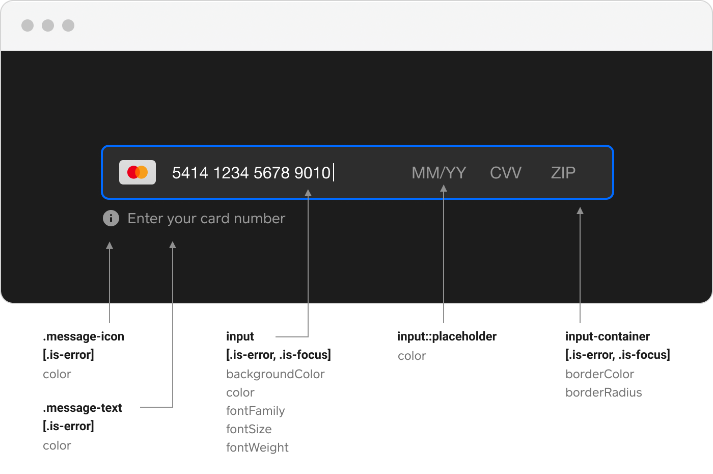
The following steps produce the dark mode card previously shown.
Add a reference to the
dark-modecss class to the body of the page.<body class="dark-mode"> <form id="payment-form"> <div id="card-container"></div> </form> </body>Add a
*tag after the current<link href="app.css" rel="stylesheet" />in the header to add dark-mode.css.<link href="dark-mode.css" rel="stylesheet" />
Declare style customizing options in the CardOptions object. The style field value is of the CardClassSelectors type.
const darkModeCardStyle = {
  '.input-container': {
    borderColor: '#2D2D2D',
    borderRadius: '6px',
  },
  '.input-container.is-focus': {
    borderColor: '#006AFF',
  },
  '.input-container.is-error': {
    borderColor: '#ff1600',
  },
  '.message-text': {
    color: '#999999',
  },
  '.message-icon': {
    color: '#999999',
  },
  '.message-text.is-error': {
    color: '#ff1600',
  },
  '.message-icon.is-error': {
    color: '#ff1600',
  },
  input: {
    backgroundColor: '#2D2D2D',
    color: '#FFFFFF',
    fontFamily: 'helvetica neue, sans-serif',
  },
  'input::placeholder': {
    color: '#999999',
  },
  'input.is-error': {
    color: '#ff1600',
  },
  '@media screen and (max-width: 600px)': {
     'input': {
        'fontSize': '12px',
     }
  }
};
Add the style parameter to the payments.card function call.
async function initializeCard(payments) {
  const card = await payments.card({
    style: darkModeCardStyle,
  });
  await card.attach('#card-container');

  return card;
}
Your application and the buyer's actions determine whether the form is shown as a single line or a two-line form. If your application has styled the <div> that the form is attached to as a fixed width of less than 480 pixels, the form is rendered as two lines. If the <div> is declared with minimum and maximum widths that let the buyer resize the page, the form reacts to a wider <div> container by rendering as a single line.