Applies to: In-App Payments SDK - Android | In-App Payments SDK - iOS
Learn how to configure the In-App Payments SDK payment screen to seamlessly match the branding of your application.
Applies to: In-App Payments SDK - Android | In-App Payments SDK - iOS
Learn how to configure the In-App Payments SDK payment screen to seamlessly match the branding of your application.
Configure the In-App Payments SDK payment screen to seamlessly match the branding of your application. The In-App Payments SDK payment form has a default theme that can be overridden and customized by completing the following steps.
Follow the steps in Build on Android.
You can customize the payment form UI by overriding the sqip.Theme.CardEntry theme resource. The style attributes that you can set are called out in the following image:
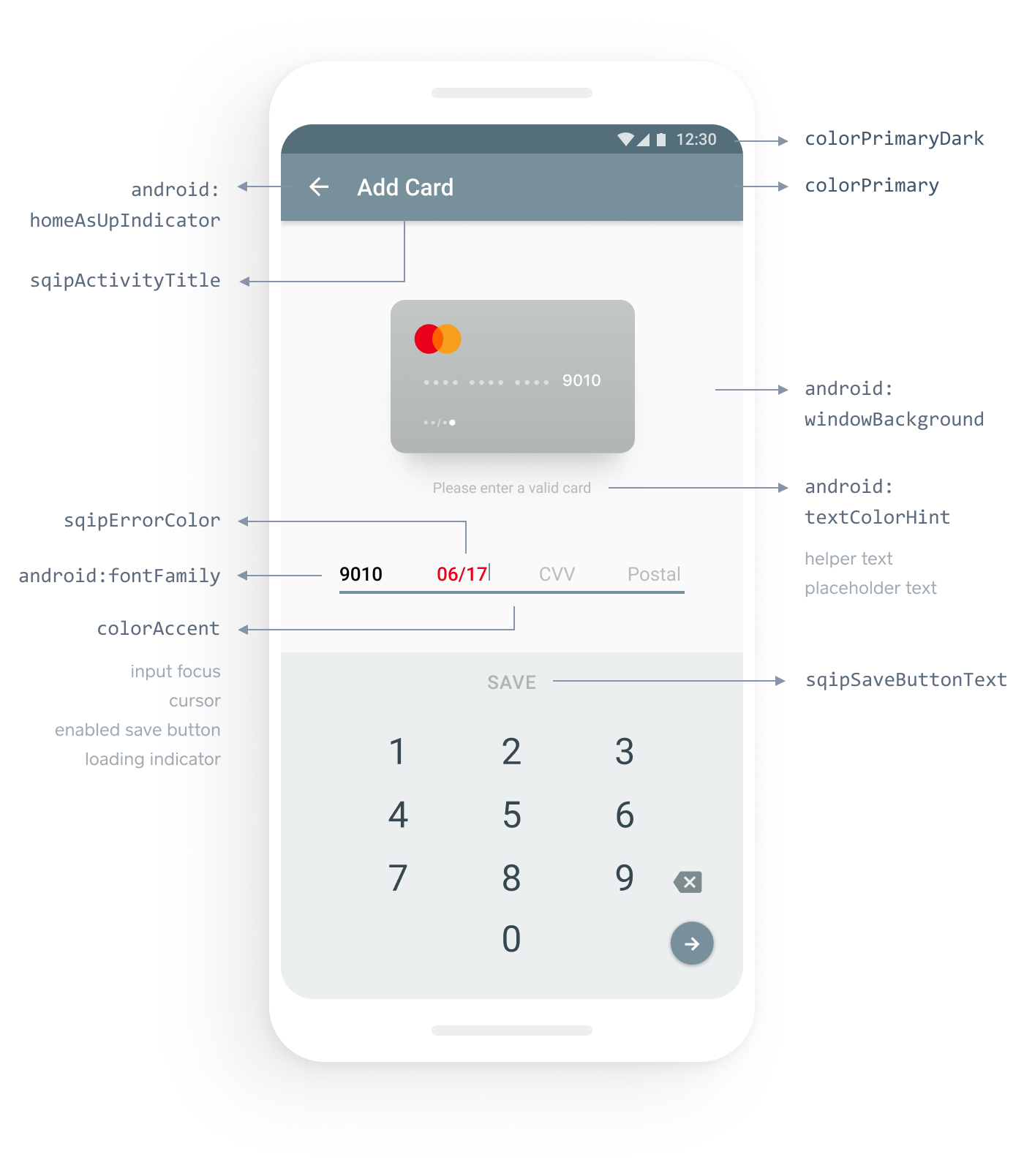
The SDK honors customization of system style attributes and provides three custom style attributes. The following table shows the most useful style attributes:
| Style attribute | Styled UI element |
|---|---|
colorPrimaryDark | The color of the status bar. |
colorPrimary | The color of the action bar. |
windowBackground | The background of the payment form. |
fontFamily | The font family applied to all text in the payment form. |
textColorHint | The color of the hint text of the card entry input. |
colorAccent | The color of the elements with input focus, active button text, loading indicator, and text cursor. |
Custom: sqipErrorColor | The color of invalid text input. |
Custom: sqipSaveButtonText | The text of the button that the customer chooses to submit card information. |
Custom: sqipActivityTitle | The title of the payment form displayed on the action bar. |
In your themes.xml file:
Create a style with name="sqip.Theme.CardEntry" and parent="sqip.Theme.BaseCardEntry". Setting the parent attribute of this style to sqip.Theme.BaseCardEntry causes the custom CardEntry theme to inherit the default style of the In-App Payments SDK.
<style name="sqip.Theme.CardEntry" parent="sqip.Theme.BaseCardEntry">
</style>
To change the text of the save button, add an item with name="sqipSaveButtonText" and a string resource value.
<style name="sqip.Theme.CardEntry" parent="sqip.Theme.BaseCardEntry">
  ...
  <item name="sqipSaveButtonText">@string/pay_button</item>
</style>
Add the item with name="colorAccent" and the value set to your desired accent color.
<style name="sqip.Theme.CardEntry" parent="sqip.Theme.BaseCardEntry">
  ...
  <item name="sqipSaveButtonText">@string/pay_button</item>
  <item name="colorAccent">@color/red</item>
</style>
Change the appearance of the save button and the card information form to match the styles in the application's theme. This overrides the style for these elements, giving the application full control over their appearance.
Add an item with name="editTextStyle" and the value set to your desired style.
<style name="sqip.Theme.CardEntry" parent="sqip.Theme.BaseCardEntryAppTheme">
  …
   <item name="editTextStyle">@style/CustomEditText</item>
</style>

<style name="CustomEditText" parent="@style/Widget.AppCompat.EditText">
  <item name="android:textColor">@color/blue</item>
</style>
Add an item with name="buttonStyle" and the value set to your desired style.
<style name="sqip.Theme.CardEntry" parent="sqip.Theme.BaseCardEntryAppTheme">
  …
   <item name="buttonStyle">@style/CustomButton</item>
</style>

<style name="CustomButton" parent="Widget.AppCompat.Button.Colored">
  <item name="android:textAllCaps">false</item>
  <item name="android:textSize">18sp</item>
</style>
Create an activity animation style with the parent="android:style/Animation.Activity". Set the desired animations for the payment form opening and closing.
<style name="CardEntryActivityAnimation" parent="android:style/Animation.Activity">
  <item name="android:activityOpenEnterAnimation">@anim/enter_from_bottom</item>
  <item name="android:activityOpenExitAnimation">@anim/stay_put</item>
  <item name="android:activityCloseEnterAnimation">@anim/stay_put</item>
  <item name="android:activityCloseExitAnimation">@anim/exit_to_bottom</item>
</style>
Add an item with name="android:windowAnimationStyle". The value should be a reference to the activity animation style created in step 1.
<style name="sqip.Theme.CardEntry" parent="sqip.Theme.BaseCardEntryAppTheme">
 ...
 <item name="android:windowAnimationStyle">@style/CardEntryActivityAnimation</item>
</style>