The following are the image-based content assets you need to provide for your listing in the Square App Marketplace:
- App icon
- Media gallery images
- Staff picks image
Note
To access a Square App Marketplace Asset Builder and Preview, make a copy of this Figma template, which includes templates for your icon, Staff Picks image, and media gallery image examples.
You can also download these Photoshop templates to help create your icon, Staff Picks image, or media gallery images.
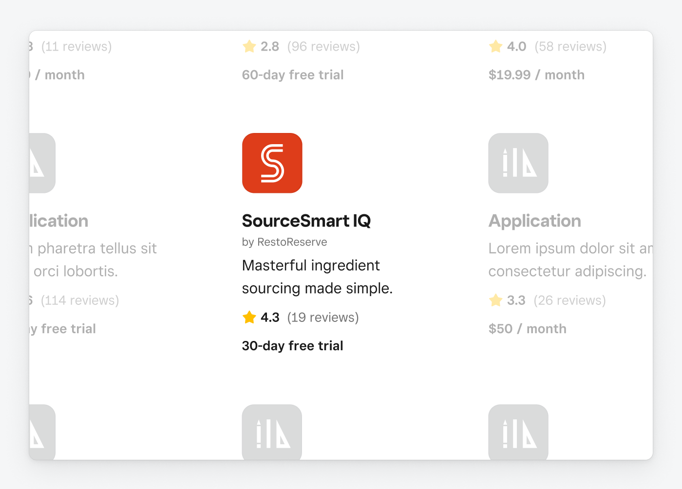
Your app icon is used in a variety of contexts throughout the Square App Marketplace and Square Dashboard and is typically paired alongside your app name.
- Make sure your app icon is unique and identifiable.
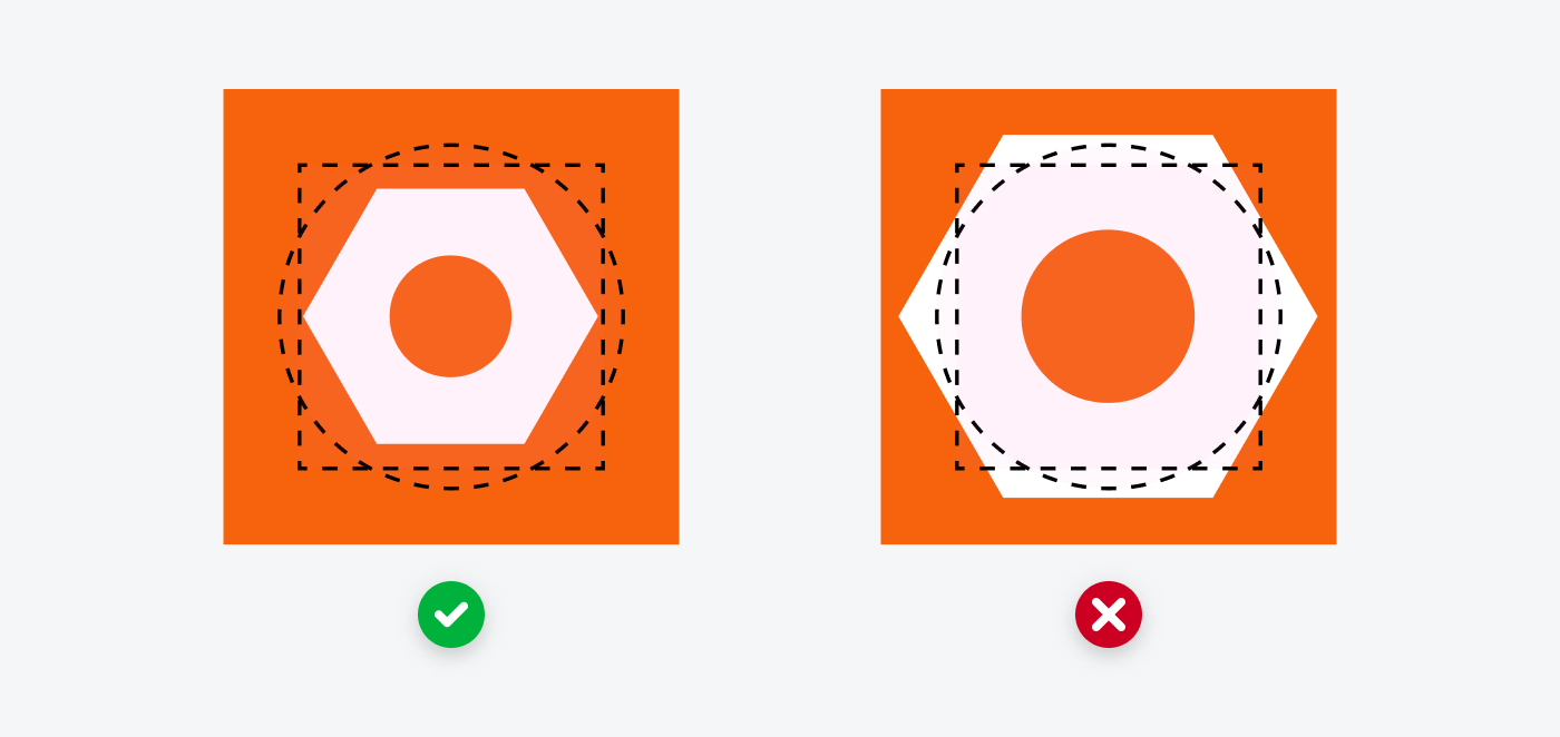
- Keep your logo within the safe zones as indicated in the templates.
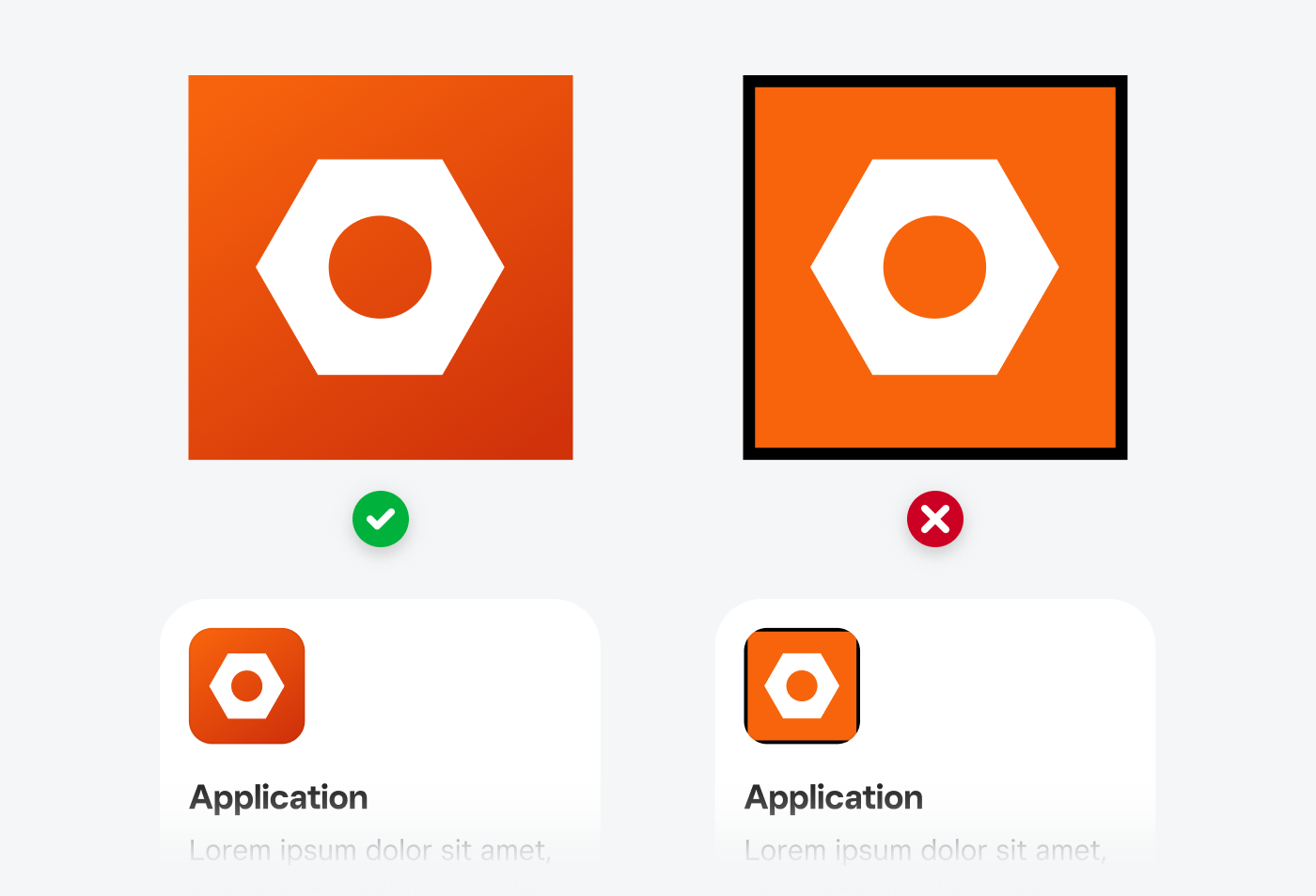
- Have a solid fill background—rounding happens automatically.
- Make sure your icon is readable at small sizes. Your icon will commonly display small at 64 px × 64 px or smaller.
- Include transparency. Your app icon image should have a solid fill background.
- Include text that isn't part of your logo.
- Include names or symbols of other brands (even if your product integrates with them).
- Include photography.
- Include a stroke around the asset.
- Dimensions: 512 px × 512 px.
- The maximum file size is 50 KB.
- PNGs and JPGs are permitted.
Keep the primary artwork in your icon within the safe area as shown in the available templates. Having key elements outside the safe area results in awkward margins between the artwork and the edge of the icon when presented on the page.
Don't use transparency. Your app icon image should have a solid fill background.
Because the corners are rounded, the app icon artwork shouldn't incorporate a border.
For your icon background, simple is better. Solid colors, gradients, and even very subtle patterns are acceptable. You won't be able to see detail in complex backgrounds at the relatively small sizes the icons appear.
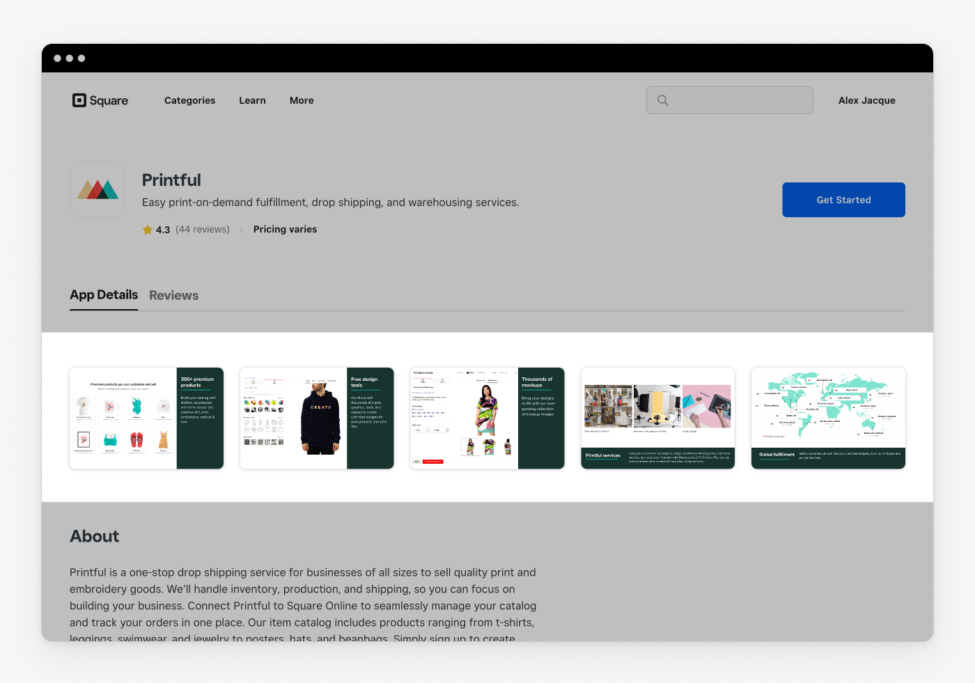
App screenshots and images that convey value and functionality give sellers a sense of what it's like to use your product.
- Use screenshots that highlight your app - These screenshots should highlight your user interface, listed features, or primary value.
- Keep it simple - Only convey one major point per image.
- Sufficient contrast - Make sure there's sufficient color contrast between screenshot images and their background. This can be a contrasting color fill for the background or even a simple drop shadow.
- Brief and large text - Keep text short and large if you use text. Many people browse on their mobile devices, so aim for a minimum font size of 32 px.
- Provide annotations - In the image, call attention to important features. Optional.
- Include personally identifiable information - Remove any such information.
- Include specific dates or years - Including such information will quickly date them (such as a screenshot of a ticket for a 2020 event). These images should be consistently current and relevant.
- Include screenshots of marketing materials or your website
- Use images as instructions - Your image shouldn't show how to configure or get started with your software.
- Include transparency
- Minimum of three screenshots.
- Maximum of five screenshots.
- Screenshots should be in a 3:2 landscape aspect ratio and at least 1500 px × 1000 px.
- The maximum file size is 400 KB per image.
- Descriptive Alt Text is limited to 140 characters per image.
- PNGs and JPGs are permitted.
- Provide a one-sentence description of the value the image conveys.
- If your image includes a line of descriptive text, you can use the same wording as Alt Text.
- Descriptive Alt Text is limited to 140 characters per image.
- PNGs and JPGs are permitted.
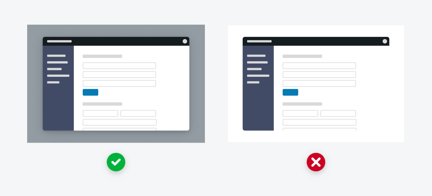
When incorporating images of your UI, make sure you use sufficient contrast so your screenshots stand out against the background. UI images with poor contrast to their background blend in, resulting in an awkward and unprofessional look.
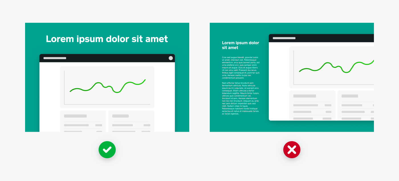
Large text that gets to the point is easy for a seller to quickly digest and can generally be read without expanding the media gallery thumbnail.
Long text in a small font size isn't helpful for a seller trying to quickly understand what your image is communicating.
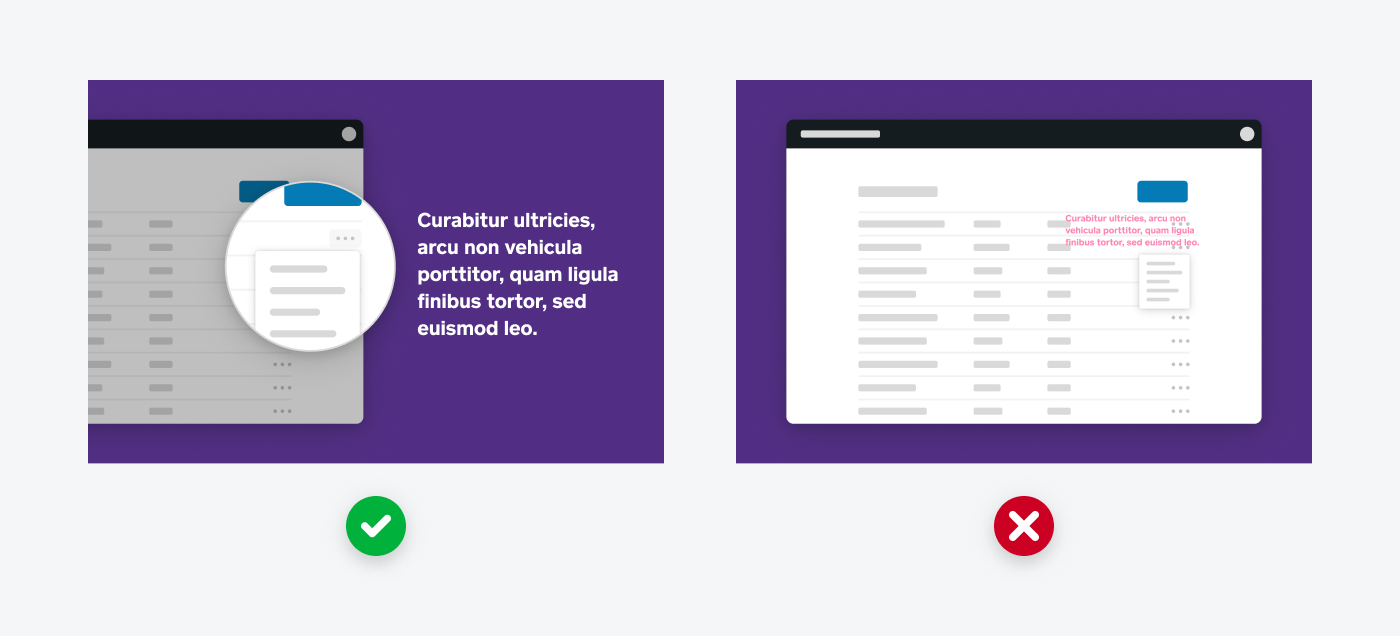
When calling out features in your UI, try to highlight them so sellers know where to focus their view.
Overlaying annotations directly onto your UI makes it hard for sellers to distinguish the UI and what you’re trying to communicate.
When you want to communicate a more abstract selling point of your product, consider incorporating illustration.
Don't include a traditional photo with your media gallery unless you add context to it using an annotation and it clearly speaks to the value your product provides.
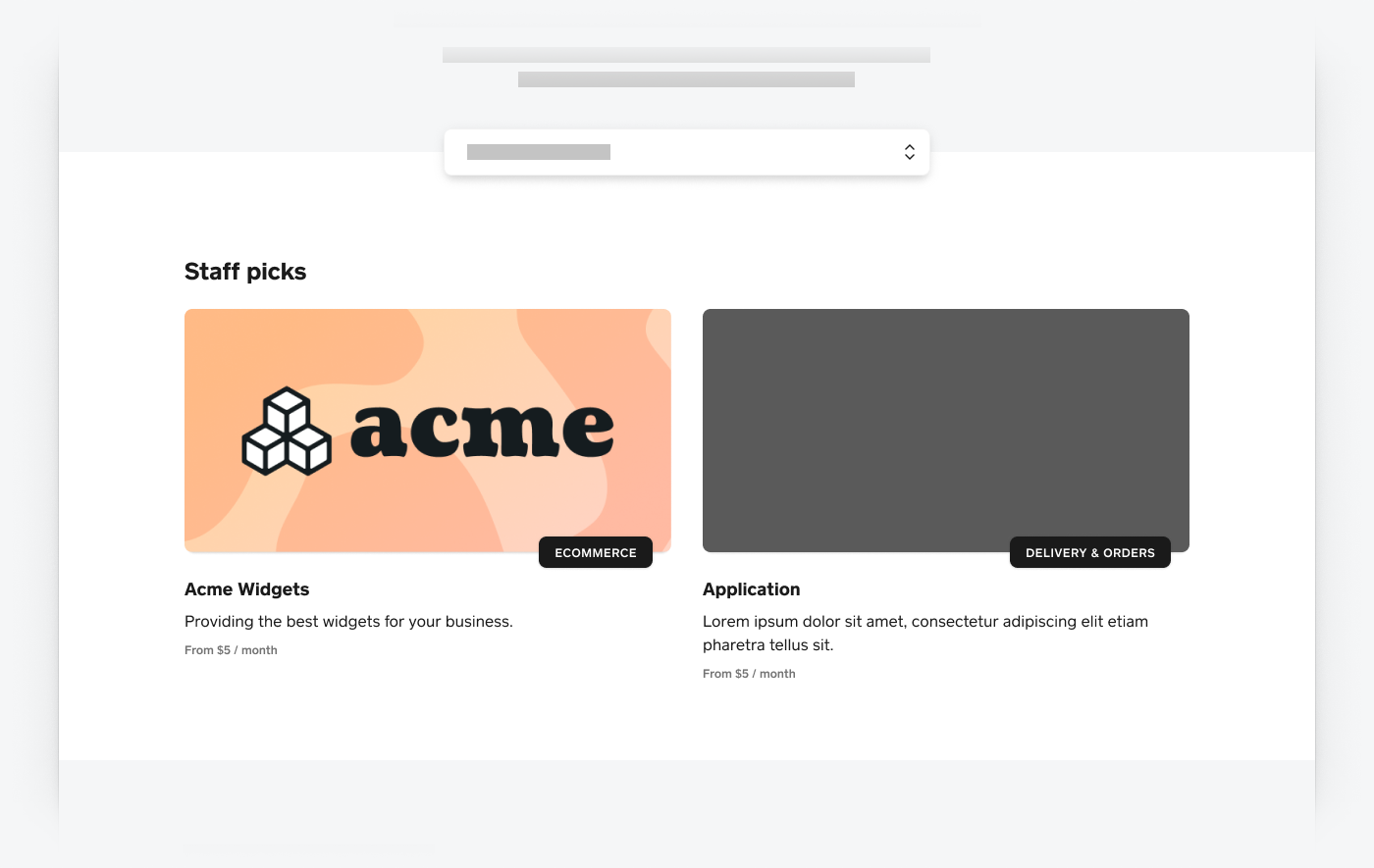
The Staff Picks image is used to feature select apps on the Square App Marketplace homepage. This image is paired with your app’s name and tagline directly below it. Providing this image doesn't guarantee placement.
- Make it engaging and showcase your brand.
- Use bold color areas and your full logo, but also consider incorporating illustration.
- Use images of your user interface.
- Use only a photograph.
- Dimensions: 1600 px × 800 px.
- The maximum file size of 300 KB.
- PNGs and JPGs are permitted.
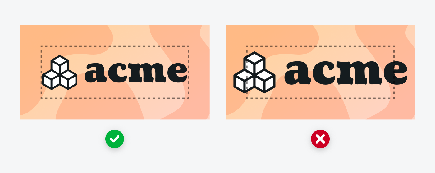
Generally, keep your logo confined within the safe area as shown in the available templates. Avoid breaking the safe area with a logo, which can result in awkwardly tight margins.
Your artwork can extend past the safe area, especially if you want to incorporate an illustration. Still, keep the primary artwork within the safe area.

Don’t just use an image of your software, and don’t submit only a photograph as your Staff Picks image. Your Staff Picks image should focus on your brand.