Design your custom payment form with SqPaymentForm
Customize your payment form using Square’s SqPaymentForm and some CSS.
Do you currently use the SqPaymentForm, but you want it to look sleek and professional? Now is your chance to figure out how to make it look like anything you want! Let’s get started.
An aside: I assume that you have at least looked over the
SqPaymentFormOverview page on Square’s doc site. If not, please do so now, because this article will refer to items from the doc site.*
Each individual input field in the SqPaymentForm will be an iFrame that is embedded from Square. This is done to protect sensitive credit card information from malicious actors, and ensures that you don’t have to worry about PCI compliance, because Square handles it all for you.
To customize the SqPaymentForm, we need to think about the areas inside the individual iFrames and also outside the iFrames, as these are handled separately.
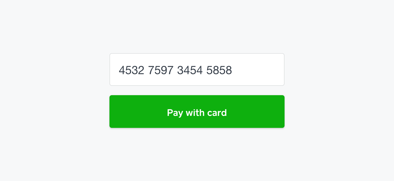
The exterior focuses on the actual text input fields (such as border, margins, and element width), while the interior focuses on the inner-text (such as font size, font color, placeholder, and background color). Here’s a quick visual aid to showcase what I mean:

Let’s see how we can edit the exterior designs first.
Exterior designs are defined in your own CSS file(in our Setup Guide, we suggest a file named sqpaymentform.css). When creating the SqPaymentForm you will need to specify the inputClass, which is the name of the class given to the text input fields that are used in the form. This could literally be named anything. You just need to make sure it matches in the sqpaymentform.css file. For example:
 This is just to point out where the the name should match!
We’re going to add the following styles:
-
Blue borders & slightly curved around the inputs
-
Box-shadow due to curved borders (instead of outline)
-
Increasing size and weight of the labels ( Note:
.labelis the class name I gave to the text labels for eachinput(ie “Card Number:”) -
Background color and font color of the button
-
Different colored borders for focus and error validation
After adding these changes, we end up with the following:
* {
  -webkit-font-smoothing: antialiased;
  -moz-osx-font-smoothing: grayscale;
}

#sq-ccbox {
  float:left;
  margin:5px;
  padding:10px;
  vertical-align: top;
  font-weight: bold;
}

#nonce-form {
  padding: 25px;
  text-align: right;
}

.sq-input {
  display: inline-block;
  border: 1px solid #E0E2E3;
  border-radius: 4px;
}

.sq-input--focus {
  border: 1px solid #4A90E2;
  box-shadow: 0 0 2px 0 rgba(0,0,0,0.10), 0 2px 2px 0 rgba(0,0,0,0.10);
}

.sq-input--error {
  border: 1px solid red;
}

.label {
  font-size: 18px;
  font-weight: bold;
  line-height: 24px;
  padding-right: 16px;
}

.button-credit-card {
  display: block;
  width: 100%;
  height: 56px;
  padding: 15px;
  margin-top: 10px;
  background: #0EB00E;
  box-shadow: 0 0 2px 0 rgba(0,0,0,0.10), 0 2px 2px 0 rgba(0,0,0,0.10);
  border-radius: 4px;
  cursor:pointer;
  color: #FFFFFF;
  font-size: 16px;
  line-height: 24px;
  text-align: center;
  outline: none;
}
One thing to point out that can be seen above is the use of .sq-input--error and sq-input--focus (this should match whatever your inputClass is set to. Ex: your-cool-input-class-name--focus). These can be used to change the appearance of your input boxes when you select them, or when there’s been some validation error returned by the SqPaymentForm. They’re great, and you should use them!
Over in the sqpaymentform.js file we need to make sure to reference it, which is easy enough; just use the same name for the inputClass as mentioned earlier:
var paymentForm = new SqPaymentForm({
  ...
  inputClass: 'sq-input',
  ...
})
Let’s jump to interior designs. The SqPaymentForm only supports certain properties for the interior, and must be supplied via the inputStyles array in your sqpaymentform.js file. For the full list of properties, take a look a look at this page: https://developer.squareup.com/docs/payments/sqpaymentform/sqpaymentform-overview#inputstyle-objects
Now, say we want to make the fields have the following styles:
-
18px text
-
Dark-grey text
-
15px padding
-
Light-grey placeholder text.
It’s fairly straight forward to accomplish this. After adding the changes, we end up with this:
var paymentForm = new SqPaymentForm({
  ...
  inputStyles: [{
    fontSize: '18px',
    fontFamily: 'Helvetica Neue',
    padding: '15px',
    color: '#373F4A',
    lineHeight: '24px',
    placeholderColor: '#BDBFBF'
  }],
  ...
})
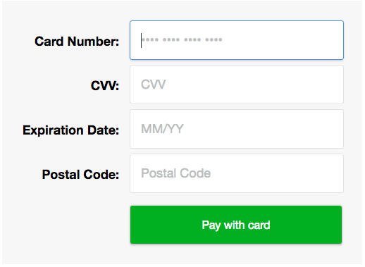
If we combined both the interior and exterior designs that we’ve quickly gone through, we’ll get something that looks like this:
 “Card Number” is selected to show off the box-shadow style. Simple, yet elegant!
That wraps it up! With this knowledge you should be able to build your very own SqPaymentForm to your liking.
Want more? Sign up for our monthly developer newsletter or join our Slack community at here.


