
Beyond Mobile First
Bringing app-like experiences to the web
Since its introduction around 2010, the concept of mobile first web design has become the de facto standard when creating new websites or web applications. The mobile first concept is especially prevalent in the e-commerce industry because over 70% of e-commerce purchases are done on a mobile device. While the market share of mobile shopping grows the average mobile shopping experience can still be considered lack-luster, and “9/10 shoppers believe that mobile shopping experiences can be improved.”
Square Online provides value to sellers by making it easy to create e-commerce websites with delightful and streamlined buyer experiences. As part of that mission, we have fully embraced the concept of mobile first design, and we are continually looking at ways to improve the mobile experience.
The first question that we can ask is, “What is the current best mobile experience?” The simple answer is to look at native mobile applications. Native apps have full control over the human-computer interface and can design around inputs such as swipe gestures, haptic touches, multi-finger taps, and other mobile-only input methods. Additionally, mobile applications can be designed exclusively for mobile devices, and do not require much thought on responsive design. Given that native apps are the gold standard for mobile experiences, the logical progression for mobile first websites is to bring native app-like experiences to websites.
App-like interactions
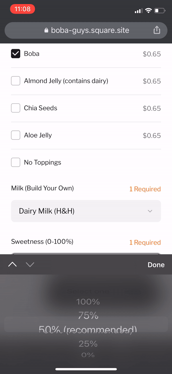
In our current iteration, the main focus is to create touch-friendly user interactions that are pleasing for mobile users and desktop users alike. To achieve this, we narrowed in on increasing the prominence and size of tap targets across our website experience and unifying the desktop and mobile experience through the use of a modal system. Most of our improved UI functionality and interactions has been through the creation and subsequent adoption of the open source design system, Maker, https://github.com/square/maker. Maker was created as a reusable component library for Vue.js and was designed to provide app-like experiences on the web.
For all of these component interactions that are described below, you can view our Maker playground and play around with the components yourself here: https://square.github.io/maker/styleguide/latest/#/
Actions bars
Our most prominent change is the addition of “action bars” to many of the interactions that occur on Square online sites. These floating buttons provide the user with large tappable actions that are only a small finger movement away. In the screenshot below, the actions allow the user to view their current order, or to search for items on the site. In other situations, the large primary button is typically a confirmation action whereas the smaller button would be an exit or cancel action. We have also added feedback animations into the action bar such as a loading state or success animation.

The concept of an action bar has had a couple of technical and design setbacks since it has been implemented. The first and most prevalent issue was the presence of a “dead-click” on mobile safari. Whenever a user scrolls down on a website in Safari, the navigation bar drops down out of the viewport. This means that the website takes up more of the screen, great right? The issue that arises with action bars is that if a Safari user taps anywhere in the bottom ~44 pixels of the screen while that navigation bar is hidden, that tap instead brings the navigation bar back into view instead of registering as a click on the website. This means that in the above use case, users would try to add an item to their order, and if the navigation was hidden, instead of registering the click on our add to order button, the navigation bar would pop up and they would have to tap the add to order button again. Unfortunately, the best current solution to this problem is to just keep the action bar above the 44 pixel deadzone height so taps always register on the action bar and do not bring up the navigation bar.
To make our action bar responsive, we have made the space under our action bar dynamic to the css environmental variable ‘safe-area-inset-bottom’. This css trick allows us to dynamically give the action bar the minimum amount of bottom margin needed for both when the navigation bar is present on the screen, and when it is not.
With the upcoming introduction of iOS 15, Apple is redesigning the navigation bar experience on Safari. There will now be an option to toggle the site navigation bar to the bottom of the screen. This means that the bottom bar of Safari screens may now be larger when open. Fortunately, they changed their designs from the first iteration which was a floating action bar of its own. The currently designed Safari action bar should not impact any website’s custom action bars too drastically and the use of the ‘safe-area-inset-bottom’ variable should still make our action bars adjust accordingly.


Current IOS 15 Safari navigation bar design (left), first released iteration of IOS 15 Safari floating navigation bar (right)
Modal Layering
One of the hardest parts of designing app-like experiences on the web is that apps are not concerned with desktop-sized viewports whereas websites are. Our solution for maintaining feature parity across mobile and desktop viewport sizes was to implement a modal system. The usage of modals across our website allows for user interactions to be designed for mobile first, but still work nicely in the desktop environment. Taking the same ‘add to order’ functionality seen above, here it is in the desktop experience:

Additionally, one of our feature requirements for modals was the ability to stack or layer modals on top of eachother. There are occasionally interactions that build on-top of each other, and we wanted to have the flexibility to implement those interactions with ease. On the desktop experience, this process took a bit of tweaking to make it look and feel right. As you can see, we’ve added some slight animations to the modals when they take over the screen or are closed to make it more obvious that the bottom layer modal context was not lost. On mobile this was easier since the modal takes up the full screen, and it is visually obvious that it is “on top” of the previous modal.

Other Thoughts on Mobile App vs Mobile Web
One area that is lacking when it comes to mobile sites vs native apps is access to a mobile phone’s native APIs. For example, many native applications will make use of force touches and haptics to provide another avenue of feedback and user interaction in their apps. On mobile websites, this is not currently possible. In the future, if these kinds of APIs are available for mobile websites we will try to incorporate them into our designs and components.
Lastly, one of the major pitfalls of trying to make websites feel like native apps is the lack of native transitions between states. Even in its most simple form of crossfading between two elements, transitions on websites are manual and complicated. When you take into accounts Modal layering and adding smooth transitions between pages, modals, and other elements, it gets very complicated compared to development in native IOS or Android. So even though Maker allows us to implement web apps with a native look and feel more easily, it is still not a perfect solution. There are very recent proposals from Google web standards to implement a browser element transition API. If this proposal, or another one that is similar, is adopted, the ease of making smooth and native feeling element transitions on the web will increase dramatically.
Authored By


