
Accessible Colors for Data Visualization
Part 1: Open-source style guide.
A good graph is easy to read. A goal when creating data visualizations is to convey information in a clear and concise way. One of the most prominent features of most data visualizations is color, but what happens to a graph for someone who has difficulty differentiating colors?
For example, an orange and green color that may appear separate to some could appear nearly identical to individuals with protanopia vision, a type of colorblindness.
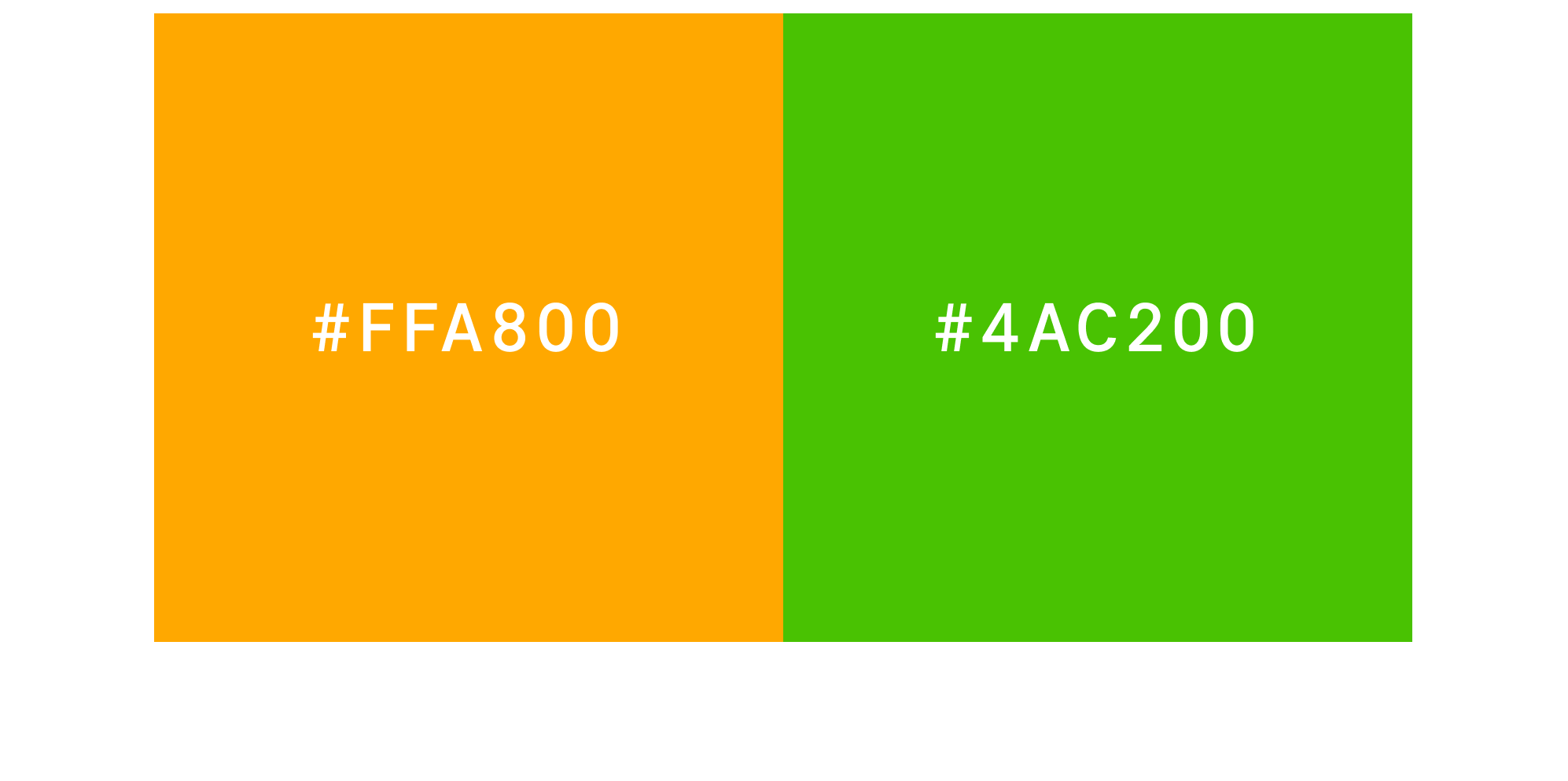 A GIF showing that an individual with protanopia vision may not see differentiation between an orange color (#FFA800) and a green color (#4AC200).
At Square, we’re building a guide for visualizing data so that data is accessible to as many people as possible. Today, we’re open-sourcing the design file to continue evolving this resource. Additionally, later this year, we’re open-sourcing a Python package for you to easily use and adapt this design file in your visualization work.
First, let’s look at what data visualizations and color vision deficiencies are:
Data visualizations
Data visualization (visualisation), or the visual communication of data, is the study or creation of data represented visually. Michael Friendly describes it as, “information that has been abstracted in some schematic form, including attributes or variables for the units of information.” Nicholas Felton describes his work as, “translating quotidian data into meaningful objects and experiences.”
Data visualization comes in many forms. Some of my favorite places to look at and think about different types of visualization:
The Data Viz Project by Ferdio, a Copenhagen-based infographic agency.
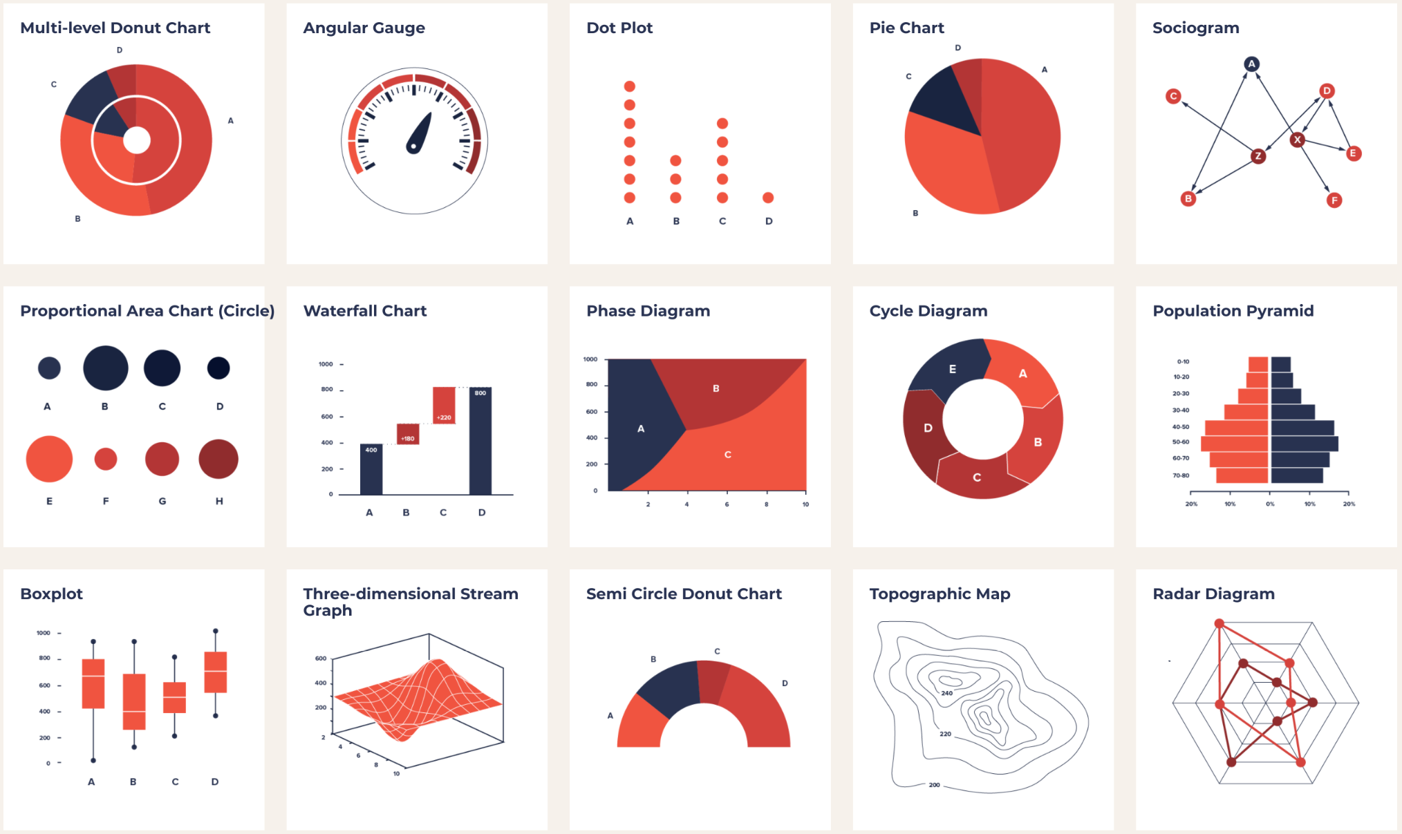 Various types of data visualizations from The Data Viz Project by Ferdio.
Giorgia Lupi and Stefanie Posavec’s project Dear Data — now a part of the Museum of Modern Art collection — is a collaboration of personal data visualizations that Giorgia and Stefanie mailed to each other on postcards.
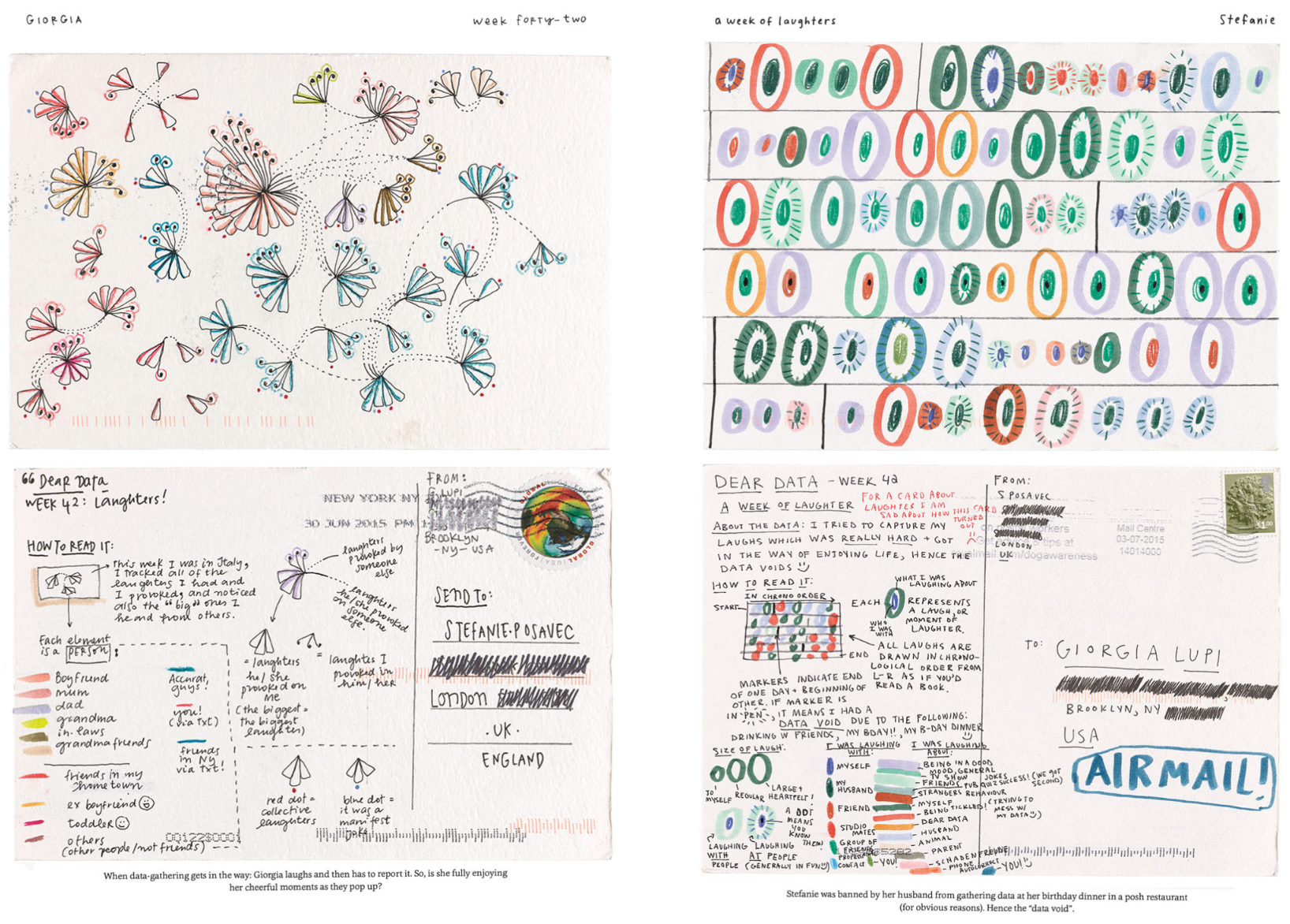 Postcards from Dear Data by Giorgia Lupi and Stefanie Posavec.
Mike Bostock, one of the key developers of D3.js, creates interactive data visualizations.
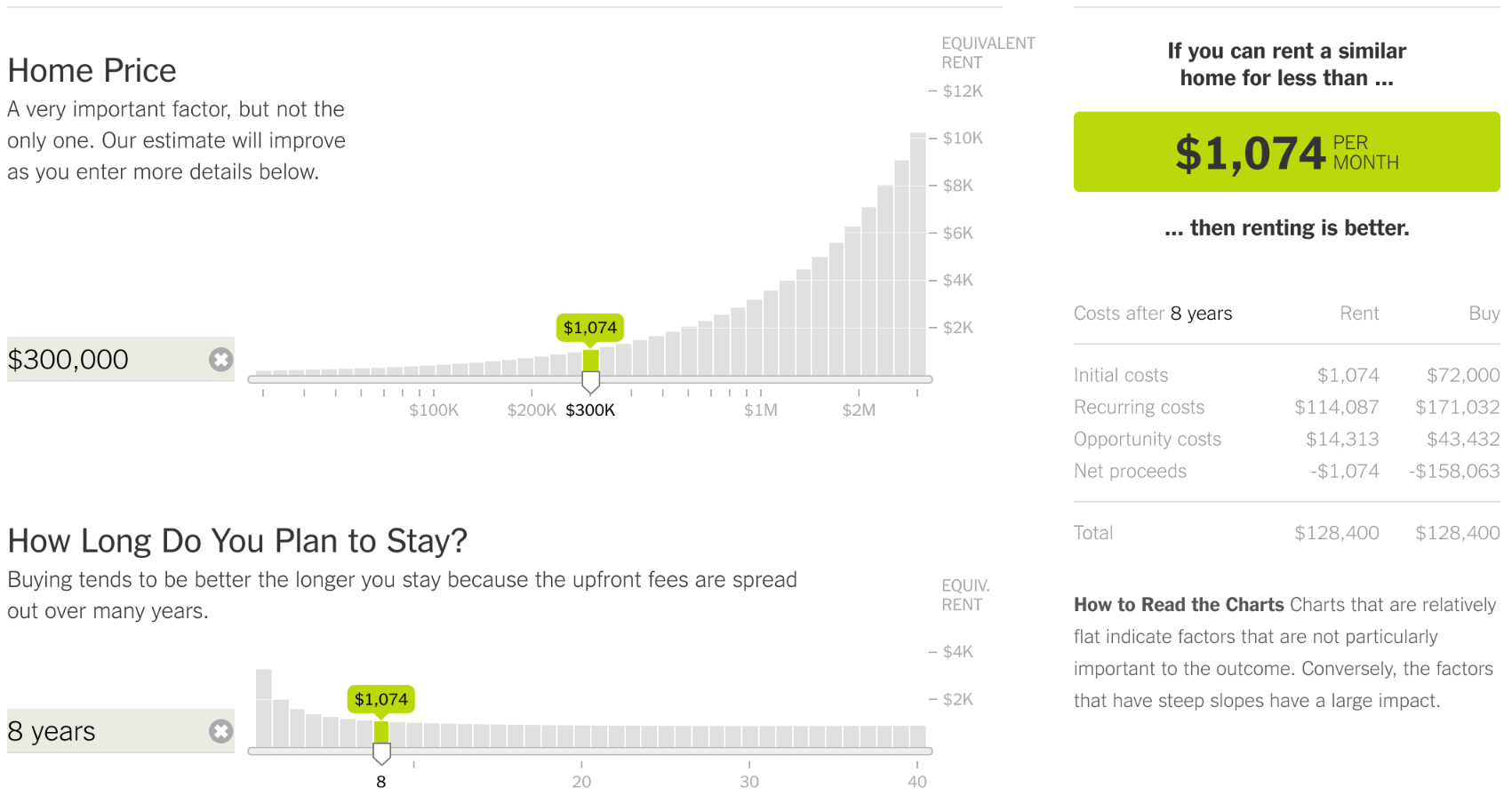 Home Price section of the Buy or Rent Calculator, The New York Times by Mike Bostock.
Also fun to check out the popularities of different types data visualizations and resources at The Visualization Universe, a collaboration between Adioma and Google News Lab.
Sources: Ferdio, Michael Friendly, Nicholas Felton, Dear Data by Giorgia Lupi and Stefanie Posavec, Buy or Rent Calculator, The New York Times by Mike Bostock.
Facts about vision
Color vision deficiency is a condition where a person’s eyes are unable to see colors in normal light situations. People with color vision deficiency have a hard time telling colors apart. Most people who suffer from color vision deficiency are not blind to color, but have a reduced ability to see them. However, the most severe forms of these deficiencies are referred to as color blindness.
Color blindness affects millions of people worldwide: it is estimated that 260–320 million total individuals are affected genetically — 1 in 12 men and 1 in 200 women. However, color deficiencies — of all kinds — vary between individuals. The World Health Organization (WHO) identifies 4% of the global population as being visually impaired, 4% as having low vision, and 0.6% as being blind.
There are a variety of classes of color vision deficiency; the most common is red-green color blindness or protanopia. Other color vision deficiencies include: protanomaly, deuteranopia, deuteranomaly, tritanopia, tritanomaly, achromatopsia, achromatomaly, and low-contrast.
Color vision deficiencies can be acquired, but most are inherited genetically. The genes that influence the colors inside the eyes, called ‘photopigments,’ are carried on the X chromosome. If these genes are abnormal or damaged, color blindness occurs. Sometimes color blindness can be caused by physical or chemical damage to the eye, the optic nerve, or parts of the brain that process color information. Color vision can also decline with age, most often because of cataract — a clouding and yellowing of the eye’s lens.
Sources: Enchroma, Colblindor, National Institute of Health, World Health Organization.
Building a data visualization guide for color vision deficiency accessibility
The use of color in data visualization is primarily to differentiate data categories to illustrate the information described as quickly and easily as possible.
The color sets in this guide are created for contrast across multiple types of reduced vision and color vision deficiencies, containing colors that are differentiated across hue, saturation, and brightness.
We also intended to use colors that we find aesthetically pleasing. Of course this is subjective and contextual—a red color might be preferred to conform to a brand’s color set, but have negative implications when used for visualizing financial information.
An element of contrast that isn’t included in this guide yet—as it’s harder to systematize—is texture. If a bar chart incorporated diagonal lines and a grid of dots, there would be another type of differentiation that would assist in clearly communicating two separate data sets.
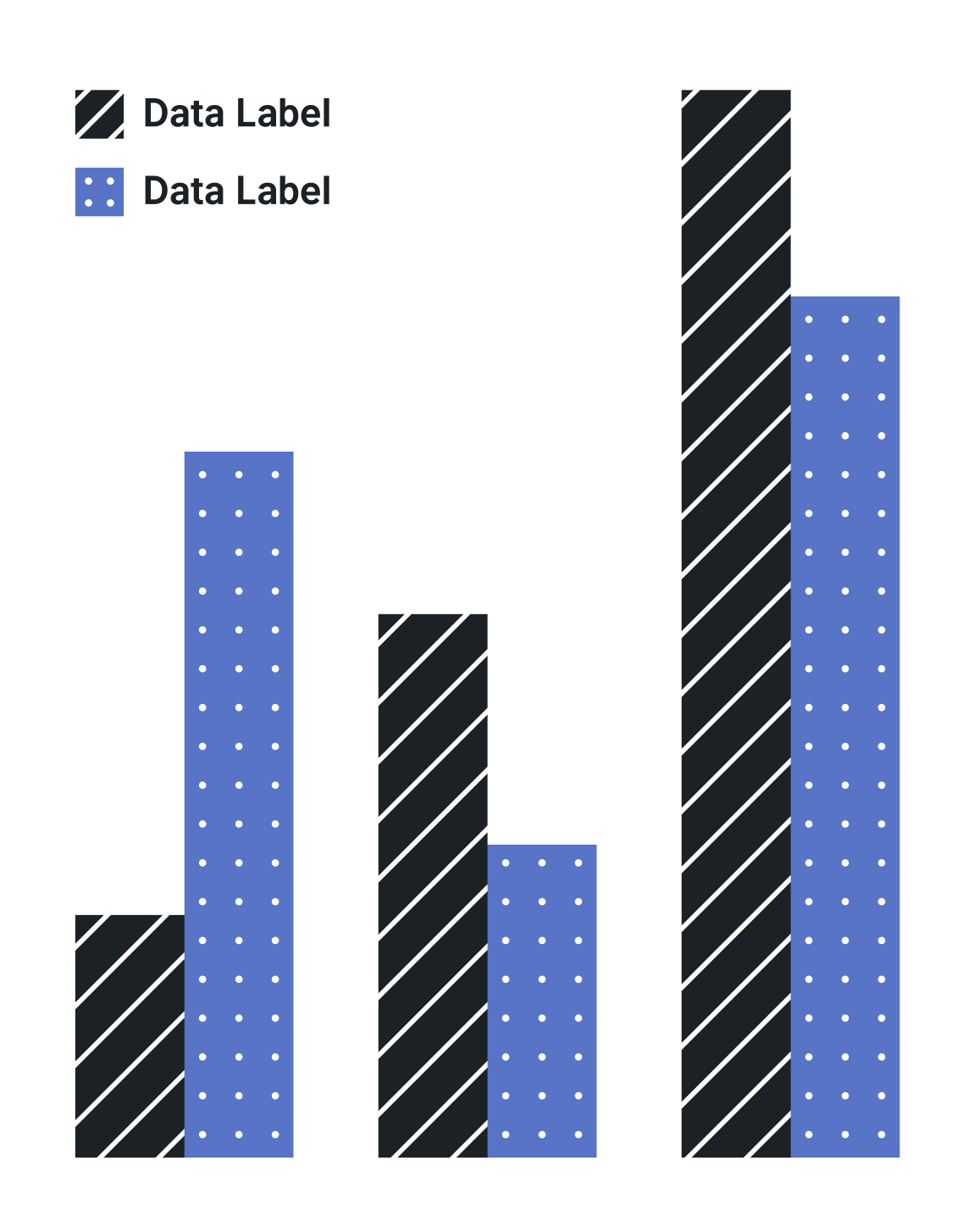 Data sets differentiated with contrasting textures are easier to distinguish than with just color contrast.
Open-source design
To contribute to the design file: Open the Figma file, login to Figma (or sign up for free), click to leave a comment, enter your feedback, and click “Post.” A live view into the Accessible Colors for Data Visualization design file.
As mentioned above, we will be publishing a Python package with these styles and guidelines that will also be open-source.
Resources for designing
There are a lot of really incredible resources available for you to dig in to when designing for color accessibility. Here are just a few that I recommend to get started with:
Article: Inclusive Design Checklist by Automattic
Article: Finding the Right Color Palettes for Data Visualizations by Samantha Zhang
Book: Accessibility for Everyone by Laura Kalbag
Guidelines: Web Content Accessibility Guidelines (WCAG)
**Video: **Story Time: Being Color Blind by Pablo Stanley
Video: How to check for accessible colors by A11ycasts
Tools:
-
ColorBrewer color palettes
-
Color Oracle menu bar app
-
Contrast macOS menu bar app
-
Stark Sketch plugin
-
Spectrum Chrome extension (especially if you are using Figma in the browser)
-
Funkify Chrome extension (beta)
We’re looking for more great tools for testing color accessibility, especially across Chrome OS and Windows. Comment below if you find any great ones!
What did we get wrong: we want to know! Comment in Figma, comment on Medium, or send me a DM. We want to continue to improve this guide and package.
*Inter UI typeface by Rasmus Andersson.*

