
Responsive Images with Apropos
A simple way to serve up appropriate images for every visitor.
Written by Gabriel Gilder.
有志による日本語訳はこちらから。
When Square’s front-end engineering team was building our Japanese website, we decided early on that we needed to support a wide variety of devices, and that responsive design was the right way to do that. (Who wants to support a completely separate “mobile site”?) However, we weren’t sure how we would serve every visitor the appropriate version of the gorgeous images shot by our talented photographers.
A whole lotta Sass
We took a look around at existing solutions for serving responsive images, but none of them quite met our criteria. Using Javascript meant extra downloads of unused images. Using cookies meant losing cacheability and made load time worse. We quickly decided that we should rely on CSS, taking advantage of the browser’s ability to parse media queries in stylesheets and only download the resources it needs on a particular device.
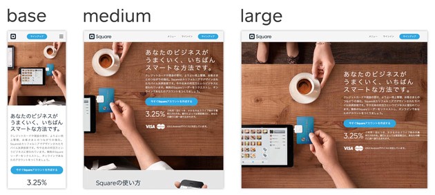
However, as we started prototyping early versions of pages, we noticed that the amount of CSS we were writing was really adding up, despite the built-in conciseness of Sass. We had settled on three breakpoints, and wanted to support both standard and high-resolution “retina” displays, so we had six different media queries to write for each image. We also planned to support more languages with the same design, which would add yet another dimension of variation.
Apropos
To solve these problems, we built a Compass extension called Apropos. The basic principle is simple: you set up your variants, which could represent different sizes, resolutions, or localizations of an image, and you define extra file extensions which map to those. You end up with a simple file naming system that looks like this:
hero.jpg            # The base image (mobile)
hero.2x.jpg         # For mobile high-res devices
hero.medium.jpg     # For a tablet-sized screen
hero.medium.2x.jpg  # High-res tablets
hero.large.jpg      # Desktops
hero.large.2x.jpg   # High-res desktops
With all the images in place, it takes just one line of Sass to load them all:
**.hero**
  +apropos-bg-variants('hero.jpg')
When the stylesheet is compiled, it generates a whopping 28 lines of CSS for you:
**.hero** {
  **background-image:** url(/assets/hero.jpg);
}
**@media** **(**-webkit-min-device-pixel-ratio**:** 1**.75),** **(**min-resolution**:** 168dpi**)** {
  **.hero** {
    **background-image:** url(/assets/hero.2x.jpg);
  }
}
**@media** **(**min-width**:** 768px**)** {
  **.hero** {
    **background-image:** url(/assets/hero.medium.jpg);
  }
}
**@media** **(**min-width**:** 1024px**)** {
  **.hero** {
    **background-image:** url(/assets/hero.large.jpg);
  }
}
**@media** **(**min-width**:** 768px**)** and **(**-webkit-min-device-pixel-ratio**:** 1**.75),** **(**min-width**:** 768px**)** and **(**min-resolution**:** 168dpi**)** {
  **.hero** {
    **background-image:** url(/assets/hero.medium.2x.jpg);
  }
}
**@media** **(**min-width**:** 1024px**)** and **(**-webkit-min-device-pixel-ratio**:** 1**.75),** **(**min-width**:** 1024px**)** and **(**min-resolution**:** 168dpi**)** {
  **.hero** {
    **background-image:** url(/assets/hero.large.2x.jpg);
  }
}
We also added features such as generating a CSS height property at each breakpoint, calculated from the image file, so that you have more flexibility to adapt your layout at each breakpoint. And we built Apropos so that it’s easy to extend to handle localization and other variations. For more information, check out the documentation.
Today we’re releasing Apropos as an open-source project. Check it out, give it a try on your site, and let us know what you think! ε=ε=ε=ε=┌(; ̄▽ ̄)┘ (@gjg) | Twitter The latest Tweets from ε=ε=ε=ε=┌(; ̄▽ ̄)┘ (@gjg). Professional poop scoopertwitter.com
Authored By
