Introducing Paralayout
From the Cash team at Square, a new iOS open-source project that makes UI development quick, easy, and pixel-perfect.
You know the feeling: the design spec comes in, polished and perfect, and you know at a glance that you’ve got two ways to go:
-
implement precisely to spec, but with a horrific mess of code and UI configuration behind it (and probably a couple of days late) or
-
ship on time, with a simpler implementation that gets the UI, you know, mostly right — and avoid looking at yourself in the mirror the next morning.
I’ll spare you a lengthy exposition of Autolayout, Apple’s constraint-based system for specifying UI via rules rather than code. While technically impressive, in practice we have found that it makes UI take longer to implement, and is much more difficult to review, reuse, debug, modify, animate, and performance-tune. On the Cash iOS team, we have embraced a different philosophy that prioritizes development speed, correctness, readability, maintainability, and performance. We call it Paralayout, it’s 100% Swift, and we’re excited to announce it’s open source!
The premise is simple: rather than taking over the task of layout, we instead make the task easier. While the Greek root auto means “self,” the root para means “help” (think paralegal or paramedic). Paralayout is not an abstraction layer; it’s a collection of à la carte convenience methods.
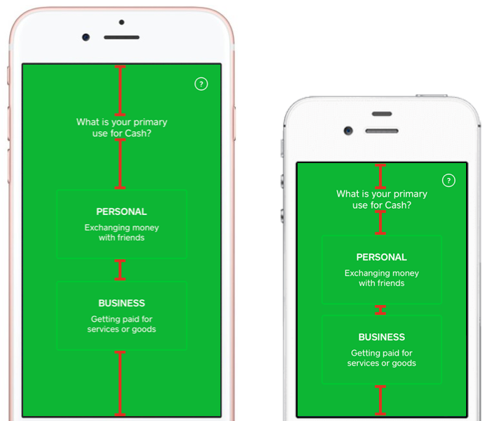
Consider this screen in the Cash app, as it appears on an iPhone 7 and iPhone 4:

The title and two buttons are vertically distributed such that the empty space above and between them is proportionally expanded or compressed on a larger or smaller screen. Our toolset gets this done with one easy-to-read line of code, regardless of screen size:
container.applySubviewDistribution([ 7.flexible,
                                     headerLabel,
                                     7.flexible,
                                     personalUseButton,
                                     3.flexible,
                                     businessUseButton,
                                     9.flexible ])
But there’s more to this design! The title text wouldn’t look correct with a naive layout: the text has a soft line break in it to look more visually balanced:

Paralayout extends UILabel to provide custom “compact” line wrapping that eliminates the need for manual typesetting. It accomplishes this by performing a binary search to find the narrowest width for the text that does not wrap to a third line. It also provides conveniences to specify attributes like kerning and line spacing without the need for messy code to compose an NSAttributedString and NSParagraphStyle. The result is text that’s much more easily localized, reused, and modified without need for extraneous testing and customization.
We’re not done! Within the buttons, the margins are fixed constants. The designer chose them based on the text itself, i.e., the baseline and the “cap height”:

An engineer typically takes those margins and reinterprets them relative to the bounds of the UILabels themselves. If and when the font sizes change, keeping them correct is a huge pain. Paralayout interprets margins relative to the font metrics within each label, so your code exactly matches the numbers in the designer’s head:
titleLabel.alignToSuperview(.topCenter, inset: 32)
subtitleLabel.align(.topCenter,
                    with: titleLabel, .bottomCenter,
                    verticalOffset: 18)
Layouts in the Cash app can get even more nuanced. This is a header in your payment activity, which gracefully collapses into a navigation bar as you scroll:

There are three distinct phases to this gesture-driven transition: the avatar hits a minimum margin, shrinks to half its height as it fades out, and then the name eases into a vertically aligned position while the other elements fade out. Getting all the math right requires calculating numerous boundary dimensions, and interpolating different values cleanly between them. We use a simple value type (a number between 0 and 1 under the hood) to get all the math right, so the code can concern itself only with the parameters:
// Figure out how far into phase 2 we are.
let avatarShrinkAmount = Interpolation(of: currentHeaderHeight,
                                       from: heightAtStartOfAvatarShrink,
                                       to: heightAtEndOfAvatarShrink)

// The avatar shrinks to half its size...
let avatarSize = avatarShrinkAmount.interpolate(from: 64, to: 32)
// ...and fades out completely.
let avatarAlpha = avatarShrinkAmount.interpolate(from: 1, to: 0)
Paralayout also takes care of pixel-level rounding, i.e., snapping views to ½-point boundaries on the iPhone 7 and ⅓-point boundaries on the 7 Plus, as well as highly adaptable and customizable tools for sizing views before laying them out. It also provides an AspectRatio value type to support aspect-fit and aspect-fill calculations (to pixel-level precision, natch).
It’s been enormously useful to us, so we’ve decided to package it all up and make it open source:
https://github.com/square/Paralayout
We hope you like it, and would love to incorporate your ideas and other challenging layout use cases into Paralayout to make it even more… helpful. Cheers!

