
Four Steps to use Sketch Libraries Efficiently
What is the height of a button?
What is the height of a button?
Where do I find this calendar?
When was the gray updated?
Why is the heading size inconsistent?
For a long time, sharing UI libraries and systems was a very manual process that often crumbled under the effort to maintain and keep everything updated. A stale style guide was very common; every time a new one was created, everyone would once again insist that this time, everything would be kept up-to-date. You know what happens after that.
To help solve some of these problems, the Product Design team at Square looked to the newly-released Sketch Libraries to help further develop our design system. Here is a four-step process to improve productivity and collaboration that we learned in the process of designing Square’s evolution of the Dashboard web experiences.
Perform an Audit
To build software, it often takes individuals or teams. The challenge to create a consistent experience increases with multiple contributors. Regardless of how mature a system is, there is always a need for new solutions and styles. This might cause the experience to diverge.
To avoid that, do an audit of every style, component, and layout in your ecosystem. Collect every variation from the latest to the oldest. For us, we found many bespoke versions of colors, typography scales, icons weights, button sizes, and more. You might run into components that are aesthetically different but functionally similar. The goal is to provide a single source of truth with well-defined and reusable components.
A unified design system is essential to building better and faster: better because a cohesive experience is more easily understood by users, and faster because it gives us a common language to work with.
 Avoid having component variations that share the same purpose.
Structure Your Library
High-Level Folders
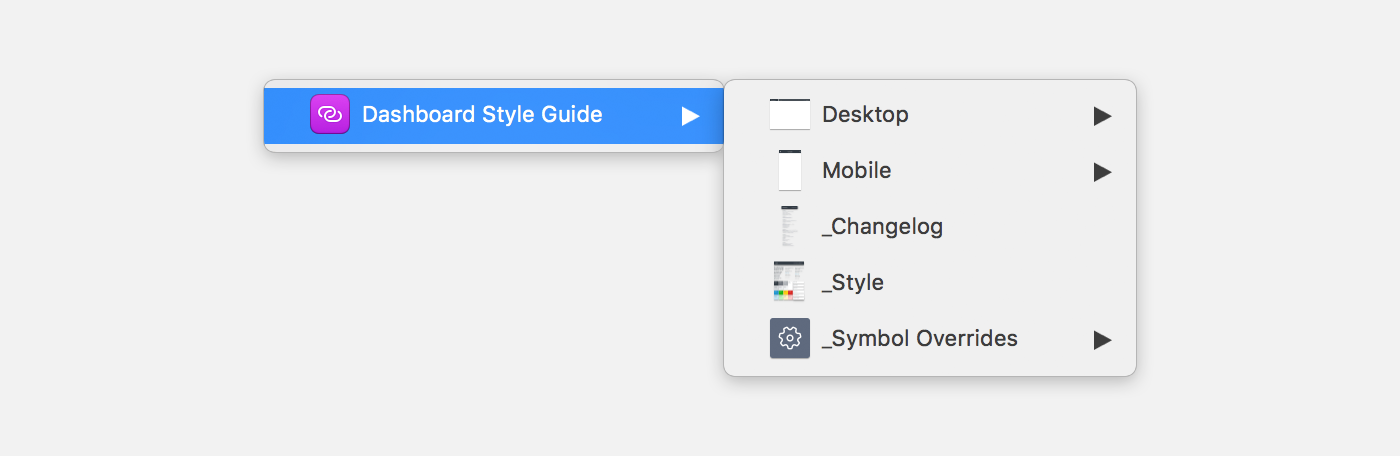
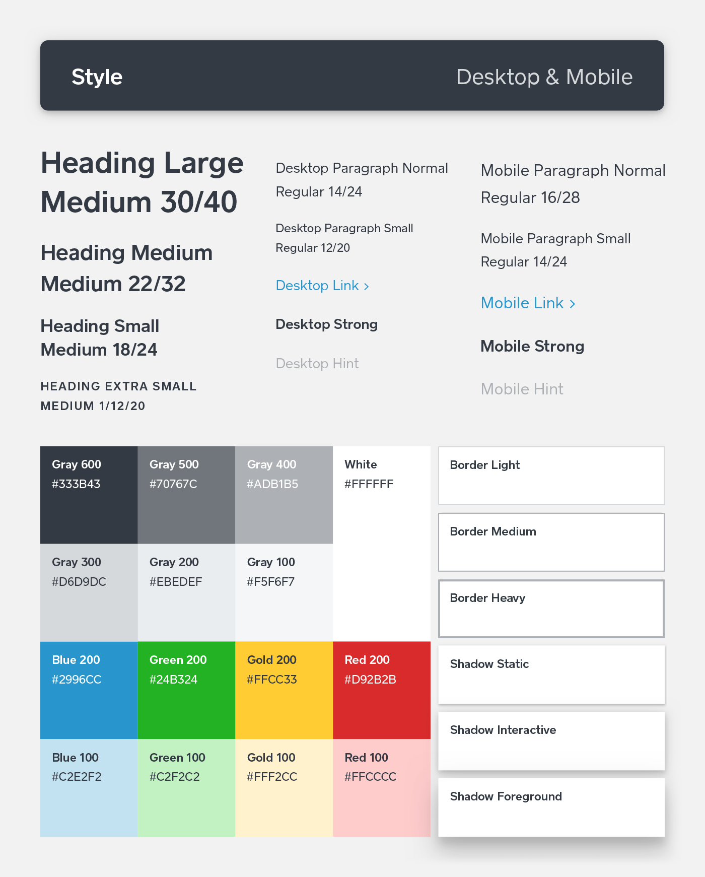
At Square, our Product Design team uses Sketch Library to share our styles, components, and layouts. It’s an effortless way for designers to stay up to date. The style guide consists of two categories — Desktop and Mobile. Each category includes layouts and components, which we’ll cover.
Name your layers wisely. Sketch automatically organizes Symbols into groups when you put a ‘/’ in the name. This way, a designer doesn’t need to switch between categories constantly to maintain a focused workflow. Menu items are sort by alphabetical order by default. Adding glyphs before the name will reorder the list item. When the structure is in place, Symbol Organizer is a great plugin to organize your symbols page and layer list, both alphabetically and into groupings.
 Use the ‘_’ glyph before the name to push secondary content below.
 Use ‘/’ to group components.
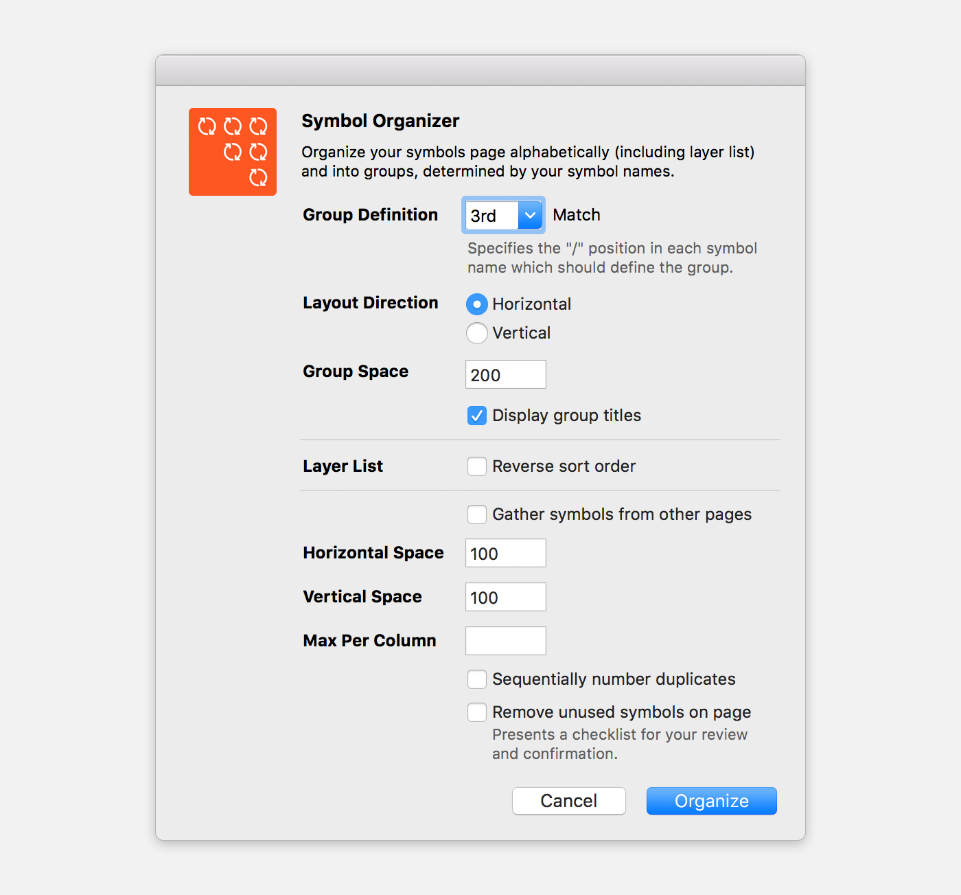 Using Symbol Organizer to automate arrange.
After figuring out the structure, we collaborated with UI engineers to find a common name for layouts and components. Thus, design and engineering can speak the same language, which will help speed up implementation.
 Sketch and Code share the same component name.
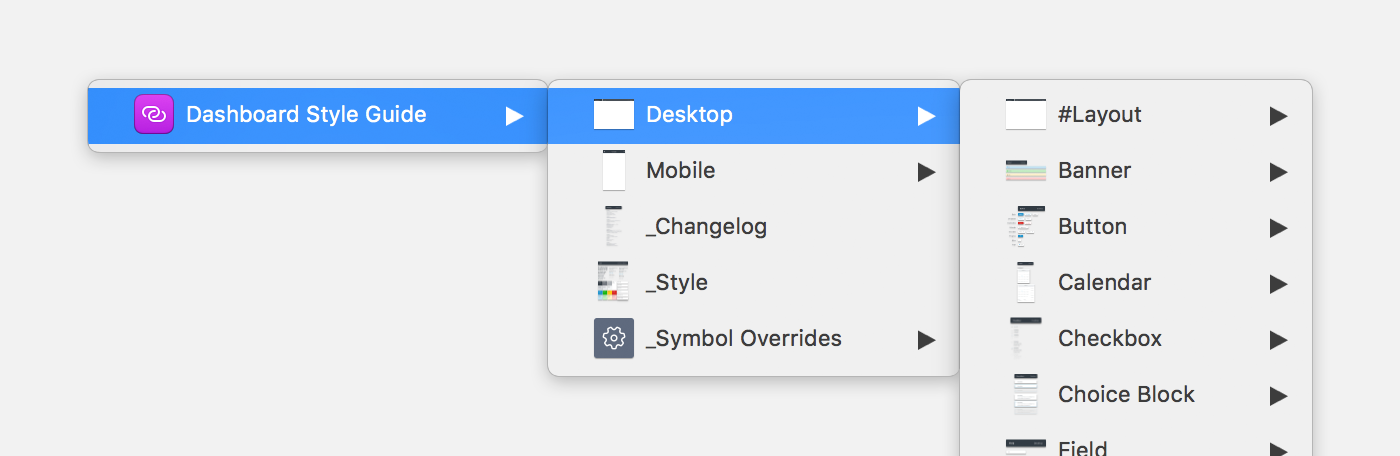
#Layouts
Often times there are very common layouts that designers reuse frequently. For example, on Square Dashboard, the layouts are pretty well-defined — pages, menus, blades, modals, and sheets. To help designers quickly use common layouts without recreating them, create a #Layouts section under both desktop and mobile. These layouts should be built as symbols and be made up of lower level component symbols. To edit the layout, you can either select ‘Detach from Symbol’ with the Inspector panel on the right or select ‘Unlink from Library’ after double-clicking the symbol. Then, the nested components are ready for editing yet remain linked to the global library.
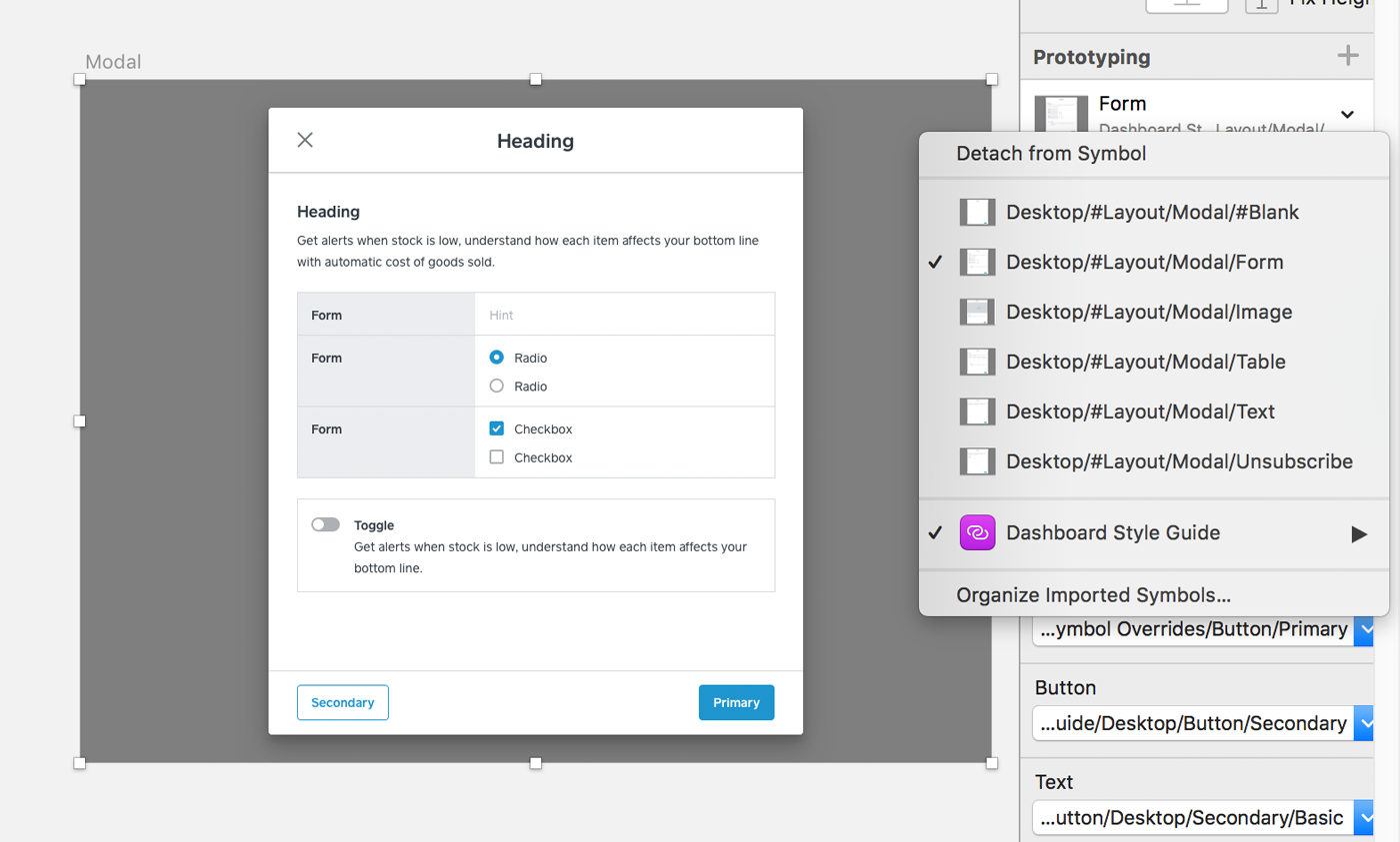 Jump between layouts quickly before selecting ‘Detaching from Symbol’ with the Inspector panel.
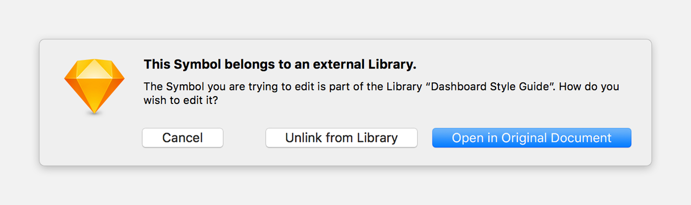 Double-click the linked symbol and click Unlink from Library.
Components: #All and Individuals
Inside each component, the #All category can really help discovery. It is a grouping of all the individual variants of the component in a single symbol. This can help identify the what you are looking for. If you already know what you are looking for, you have the option to insert an individual symbol.
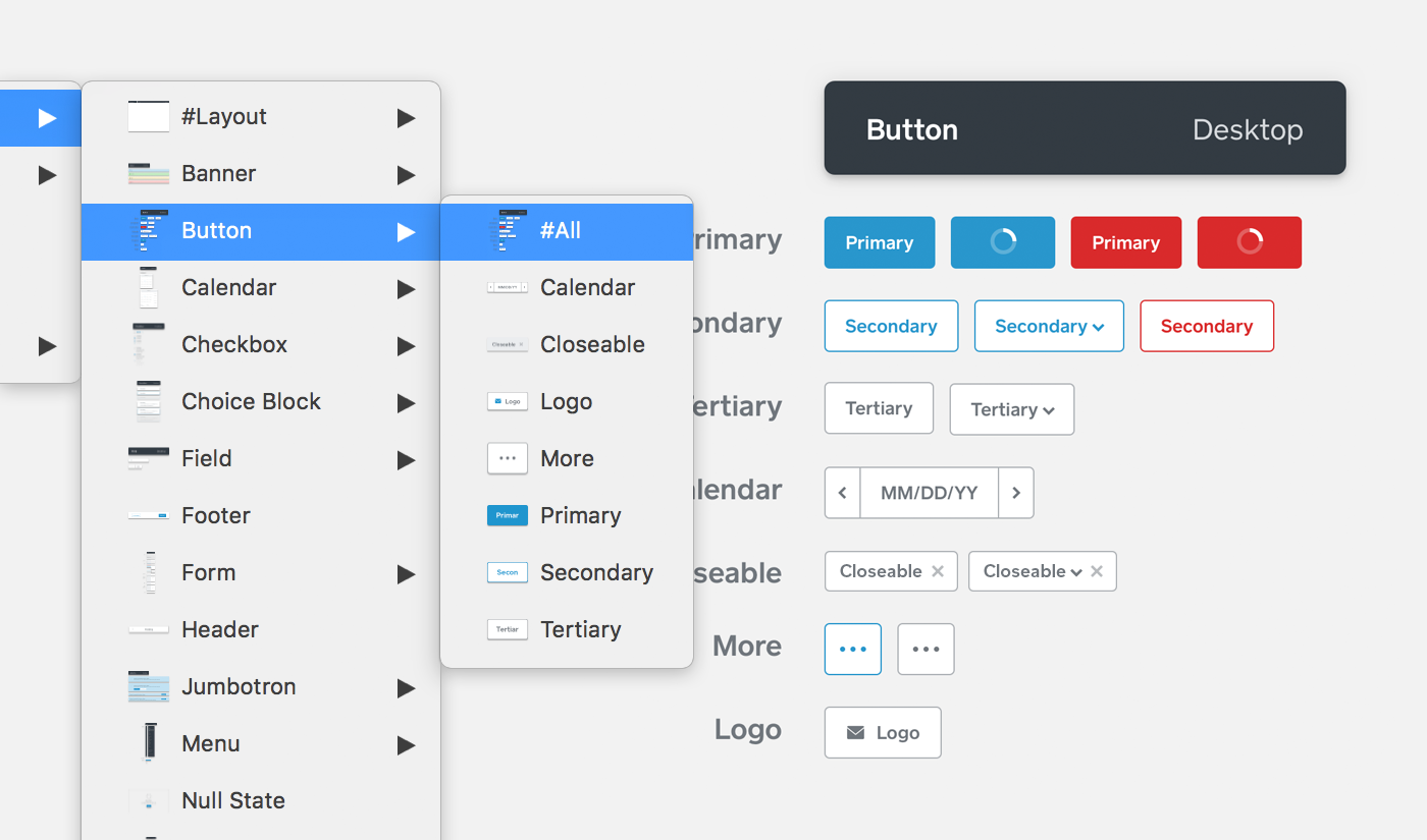 Use the #All symbol to see the all the components in a collection.
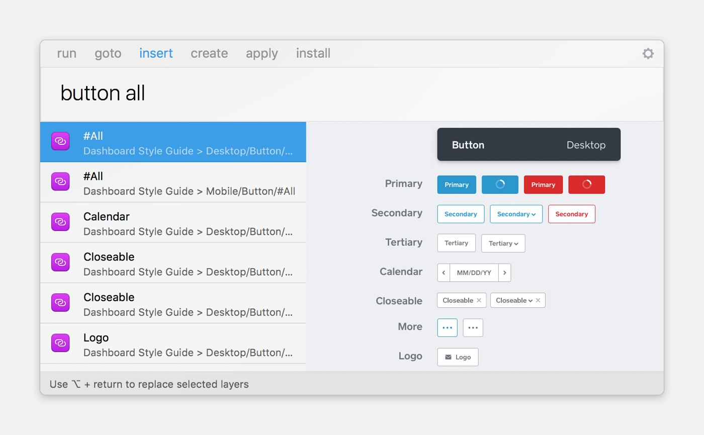 With Sketch Runner, you can quickly add a collection or an individual symbol.
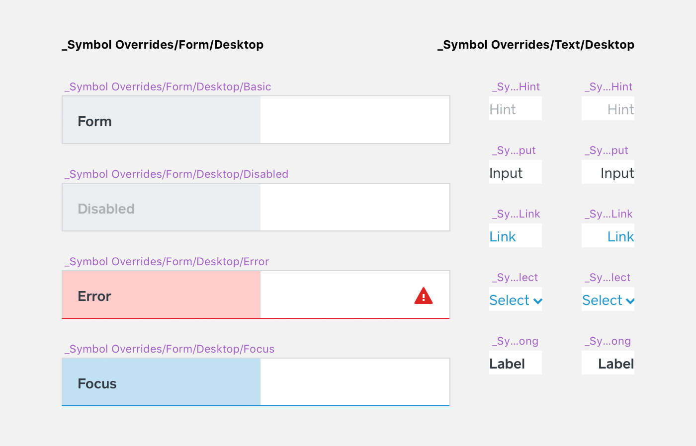
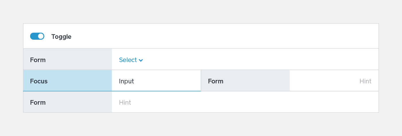
Allow for Variants
As product designers, we use symbols to create and follow our own constraints. A form with multiple variations relies on a well-organized and structured system. Symbol overrides allow you customize text, color, border, and background. These overrides are child symbols that are nested in a symbol. This method prevents designers from breaking a symbol when the overrides are explicitly listed in a component.
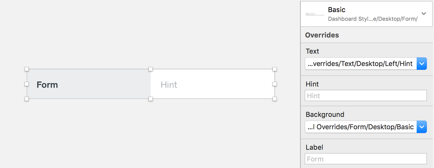 With one symbol, you can easily switch between states with symbol overrides. This Form consists of two child symbols, Text, and State.
 Use similar artboard sizes to categorize child symbols. The Text symbols are reusable in other components.
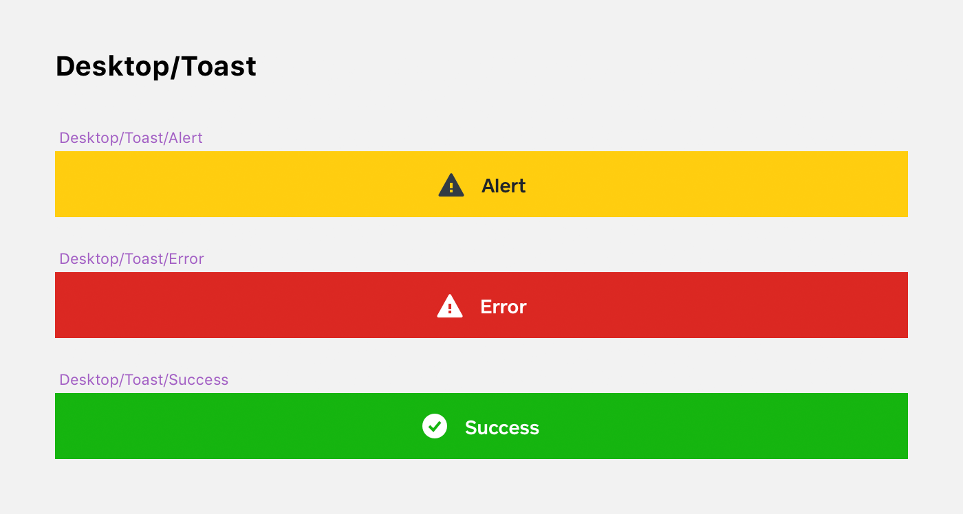
 Form borders have a right and bottom offset of 1px to stack seamlessly.
Communication
There is no single solution to every problem. Sometimes, a component is tweaked for a specific use case. A designer often collaborates with an engineer to make those changes; if several product teams are doing that, it will result in multiple versions of a component. To avoid that, designers and engineers are encouraged to consult the Square’s User Interface Guidelines before releasing any changes. This ensures a consistent user experience and maintains code quality.
By updating the code base before the Sketch library, engineers will always have the latest assets. This way, communication is clear between design and engineering. For design, Sketch files with symbols that are linked to the style guide can be updated with a click. It’s effortless and automated. However, layer and character styles do not migrate from the library currently. We’re using a style symbol to share these styles. The layers of these styles have a naming convention. Sketch automatically organizes styles into groups when you put a ‘/’ in the name.
 Detach the symbol before adding the styles.
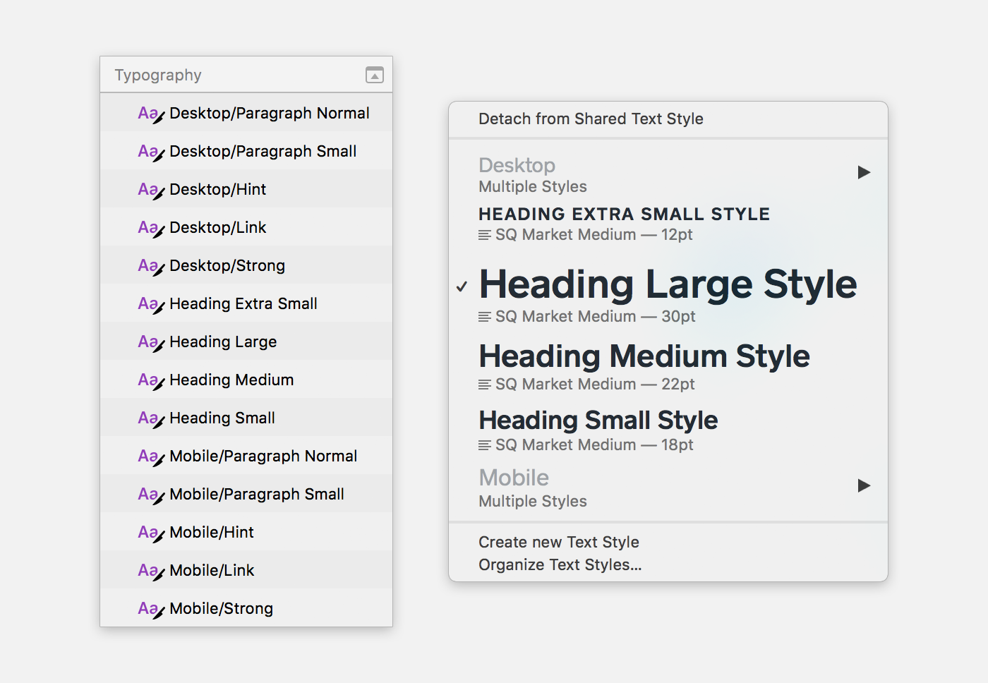 Use ‘/’ to group character and layer styles.
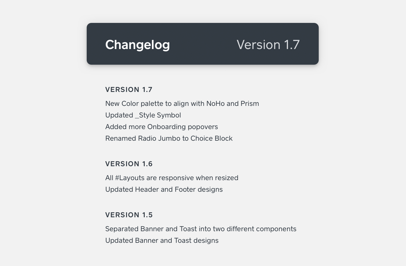 Stay updated with changelog.
Authored By
