
Documentation Details Matter
A Designer Delves into the World of Developers
Not too long ago I joined the Developer Platform team at Square as a product designer. One of the first things I was tasked with was addressing some quick-hit, tactical improvements we could make to our existing site to improve the developer experience.
A designer on a developer team? Working on documentation? “Oil and water,” you might say, but quite the opposite. I’ve waded through my fair share of documentation, Stack Overflow posts, and random blogs, teaching myself various languages over the years. Needless to say, I assuredly empathize with our developers. Documentation that is poorly structured, has poor wayfinding, or doesn’t include enough context is… frustrating, to say the least.
The following is a rundown of the frustrations our developers have encountered and the steps we’ve taken to address them.
Global Navigation Bar
Square’s developer resources have been growing for some time. Currently we have our main documentation, a few separate full API references, and our Developer Dashboard. Until now, there was no consistent way to navigate between all of these properties.
We recently added a layer of navigation above these separate destinations to allow visitors to quickly get to the information they need without getting lost.
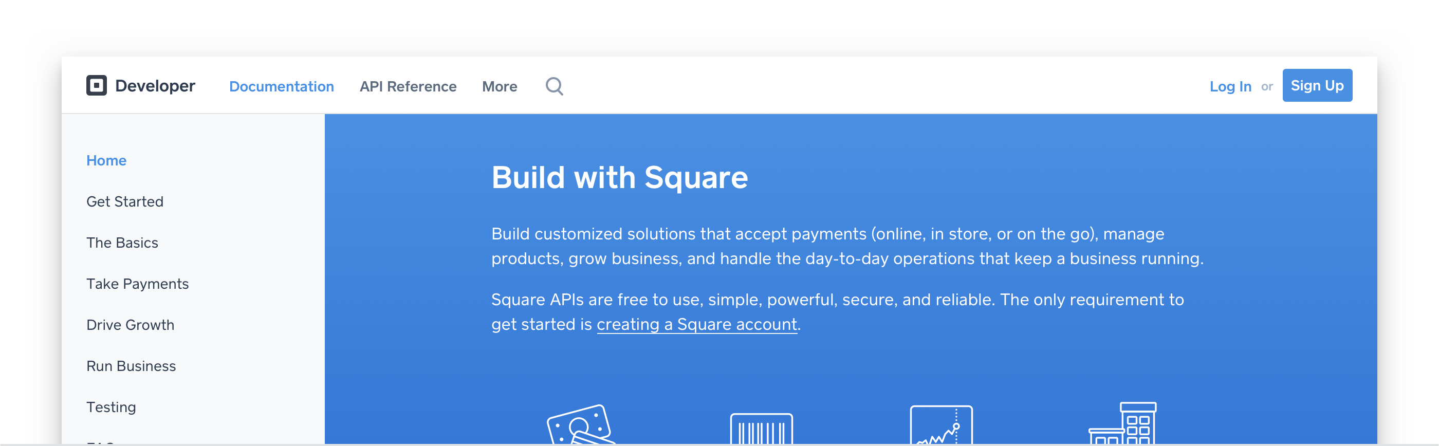 One navigation construct to rule them all.
In-Page Navigation
Our documentation contains a lot of information on how to get going and be successful with our APIs. Similar to other documentation you may be familiar with, this information may consist of one-off pages or multipage guides. The latter were particularly problematic because there were no clear “what next” guiding calls to action at the bottom of pages. Furthermore, what if a reader started with the second or third article in a series that had crucial information in the first? How would they know what they’d missed?
To address this issue, we added the ability for our technical writers to specify explicit “Previous” and/or “Next” navigation with the related articles’ titles at the bottom of the page to help guide readers to the subsequent article in the sequence.

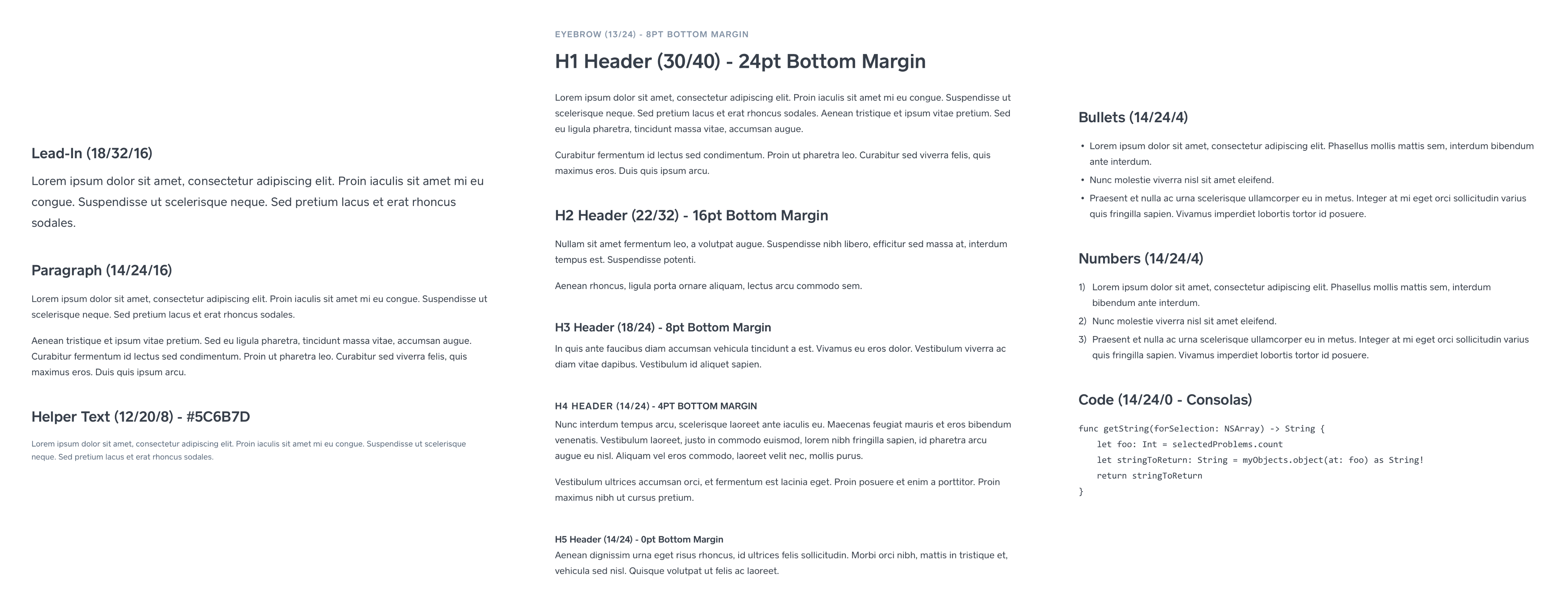
Typography
Articles with lots of information can be hard to parse if the typography isn’t up to snuff. Poor line-height and text contrast (weight, size, color) choices can easily impair reading comprehension, which is definitely not something you want in your docs.
One of our least obvious tweaks to our documentation was to clean up some of our headers and make sure they had enough white space around it to clearly divide sections without disconnecting related text. We also tweaked the header font-weight to medium from regular to make sure content was easier to quickly scan.
Supplemental Information
It’s pretty common in documentation to have supplemental, aside-type information to give more context to the concepts being explained, be it general information, tips, or even warnings. The treatment of these asides may seem a bit trivial at first: just stick ’em in a box, and maybe give the container a color fill to differentiate it from the article content and call it good. It’s actually pretty easy to get acclimated to seeing and skipping over them, which may be fine for some general notes but could be potentially disastrous for warning content. Unfortunately, this was exactly our predicament.
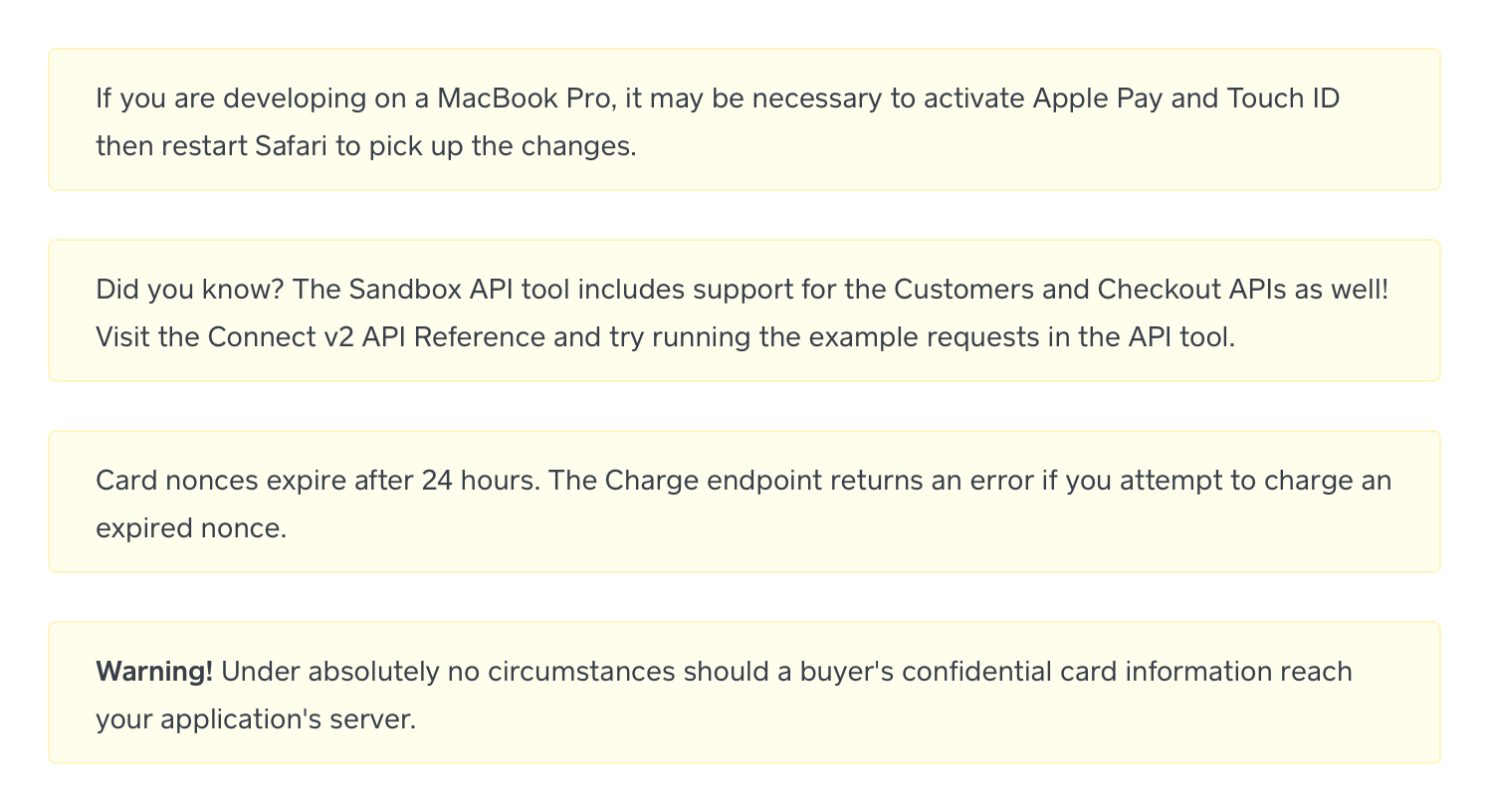 * (Before) Different types of messages that all carry the same importance.*
We addressed this issue by adding more visual indicators to our asides via color and iconography, while keeping a consistent base structure to continue to help set them off from the normal article content. Now we’re able to differentiate between warnings, tips, and general informational notes.
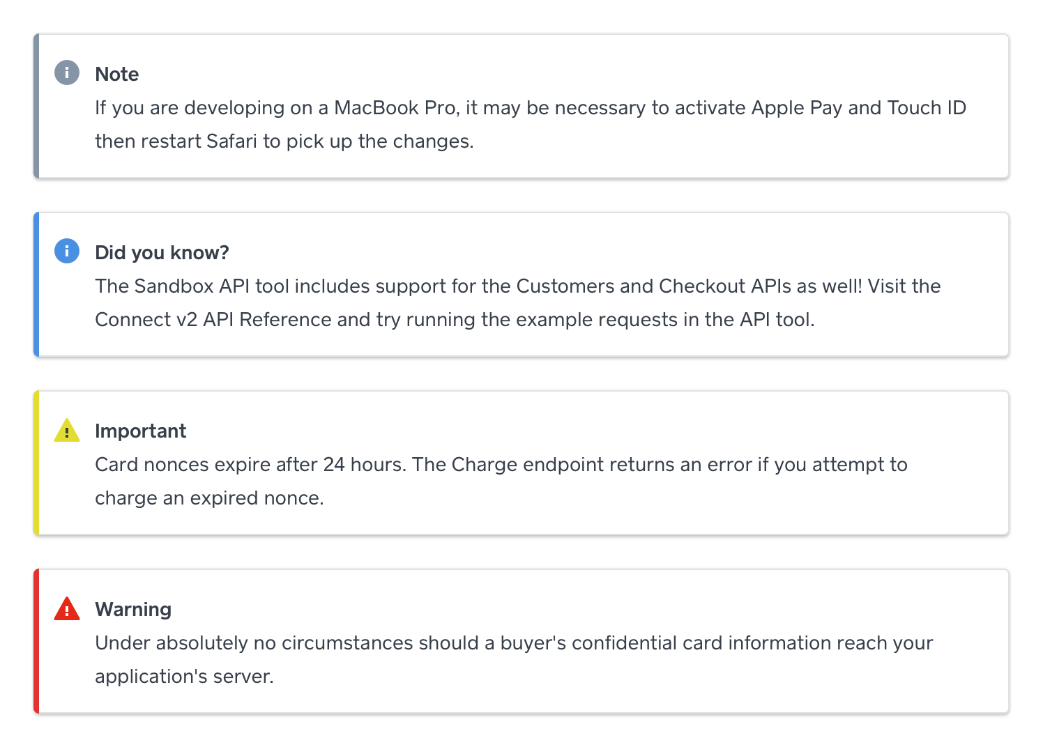 * (After) Asides that clearly highlight the type of information they contain.*
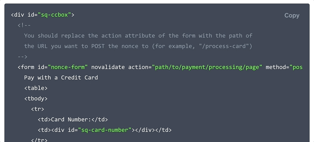
Code Examples
In the development process, it’s pretty common to copy and paste blocks of code of varying sizes from online guides into a file you’re working on. It can be tricky to select and copy whole blocks, especially if they have horizontal scrolling and require you to scroll vertically to see it all.
We added a copy-to-clipboard feature to some of our code blocks to make it easy for our readers to copy entire examples with the click of a button.
More to Come
These small but much-needed refinements are just the beginning of more improvements to come for the Square Developer Platform web experience. Stay tuned.
We’re always open to hearing how we can improve. If you have feedback, please let us know on our Slack channel!
Want more? Sign up for our monthly developer newsletter.

