
Improving Conversion Rates with Analytics, Design Principles, and UX
Co-Authors: Rohini Pandhi (Product), Jeremy Lubin (Design), Rajat Mittal (Engineering), Rachel Smith (Analytics)
Co-Authors: Rohini Pandhi (Product), Jeremy Lubin (Design), Rajat Mittal (Engineering), Rachel Smith (Analytics)
Customer experience friction
We have big plans for Square Invoices, and we are constantly building new features to help our sellers easily send invoices and get paid fast.
A few months ago, we reached an inflection point with the product. Square Invoices had come a long way from where we started and our sellers love the simplicity of our solution. However, as we ramped up thousands of new sellers and developed more and more features, the product began to feel cluttered and confusing. We literally couldn’t add another feature to our creation form without the layout becoming overwhelming. We needed to increase functionality without sacrificing the ease-of-use that Square sellers value and for which they came to us in the first place.
That’s when our team used analytics and design thinking to solve the problem. Our original form gave high visual prominence to fields that were seldom used and lacked a clear visual hierarchy, contributing to a sense of clutter that was compounded by the addition of any new features.
And the data proved it.
Initial findings
We performed UX analysis of field usage data to determine how existing sellers were interacting with fields and features in the Invoices form. We found the most frequently-used fields on the creation form forced a customer to dart from the top left side of the screen, to the middle right, and then back to the bottom left. Finally, they had to move their attention back to the top of the form to send the invoice to their buyer.
The old Square Invoices creation form:
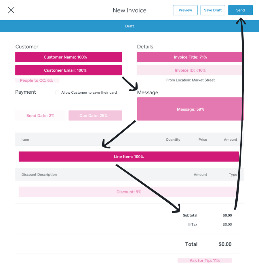 The overlayed pink fields highlight the heat map of usage in the old creation form
Obviously, this zig-zag pattern was less than ideal. In order to improve our product, we had to make some pretty significant changes to our design.
Redesign: Getting organized
We built a new experience that drastically improved and streamlined the invoicing process. A single-column layout was used to create a clear page hierarchy, with left-side labels for improved scannability and comprehension and a strong visual foundation for future features. It even follows the recommended F-Pattern layout pretty well too.
Our new Square Invoices creation form:

We tested the usability of this new form with a few select Square Invoices sellers who actively use this product. Once we had initial qualitative feedback, we prepared a good old-fashioned A/B test to determine which form performed better.
Our hypothesis and measurements of success
Before starting this experiment, we discussed and outlined our primary success metrics. The most important of those was the rate of invoices being sent between the control group and our test group. Our hypothesis was that Square sellers would be able to glide through the new invoice creation flow more efficiently with the more organized layout, which would lead to an increase in the number of invoices being created and sent in the test group. We also tracked a few secondary metrics including: creation rates for new sellers who had never used the product before, bottom of the funnel product usage, and the number of support tickets that were created.
Performance lift from the face lift
And the results? Drum-roll please… The new form won! We saw a statistically significant 1 percentage point increase in the number of invoices being sent with the group of sellers that saw our new creation form. Not only that, but there was an increase in the number of sellers sending a second invoice with the new form. In other words, this re-design helped drive engagement at the top and bottom of our product usage funnel.

This result was great validation that the new form was a dramatic improvement over the old experience. We didn’t change any of the core functions within the form, we simply made it easier to use by designing an improved organized experience — and that drove growth and conversions.
But as all product teams know, “nothing lasts, nothing is finished and nothing is perfect” (Richard Powell). We’re working on even more updates and features for Square Invoices to help our sellers send their invoices easily and get paid quickly!
*Big thanks and kudos to all the teams who worked on this project including Design, Engineering, Analytics, Support, and Product. If you’re interested in joining our team, check out *https://square.com/careers!
